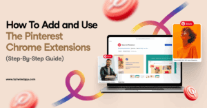
Build better brand recognition, awareness, and loyalty with color psychology in marketing! Explore the emotions behind every hue to choose a palette that reflects your brand. Learn how to use color for CTAs, backgrounds, and text!
There are SO MANY color theme options for your feed out there for you to consider, it can be hard to pick the right one! Especially if you’re a Libra. ♎️ #AmIRight
That’s why we’ve put a fun twist on our roundup of the best Instagram color themes out there in 2023 – matching them to your zodiac sign!
So if you’re looking for a little celestial style inspiration, you’ve come to the right place. Read on to see the best color theme ideas for Instagram based on your astrological sign!
Plus, we’ll show you an example of a feed working these colors, and provide you must-know tips on how to make an Instagram color theme from your palette!
Psst… don’t like your cosmic color palette? Swipe one from another sign. We won’t tell!
Capricorn Instagram Color Theme
Dec. 22 – Jan 19 Elemental Sign: Earth
Capricorn, you’re known for your ambition and down-to-earth attitude! Your Instagram color theme reflects that with earthy, no-nonsense shades found in the real world.
The Capricorn Color Theme for Instagram
This Instagram color theme is made up of natural hues like Jungle green and artichoke.
Hints of earth tones are off-set by warm neutrals.
Grab color-friendly photo editing appslike A Color Story to make your photos pop!
Pisces Instagram Color Theme
Feb 19 – Mar 20 Elemental Sign: Water
Pisces, you’re blessed with a huge imagination and creativity. Your friends and coworkers love you for your bottomless well of empathy, and for the romantic rose-colored glasses you see the world through.
The Pisces Color Theme for Instagram
Heart and deep emotions are symbolized with warm pink and calming blue shades.
Neutral champagne signifies your warm, calming presence, while sunny crayola yellow emphasizes your fun-loving, go-with-the-flow vibe!
Keep your feed cohesive by emphasizing aqua and grey-blue as your primary shades.
Add pops of yellow and melon to warm things up – Aim for 70% blue, 15% yellow and 15% melon.
Experiment with romantic textures, like fade and a teensy bit of grain (VSCO the perfect app for this!)
Aries Instagram Color Theme
Mar 21 – April 19 Elemental Sign: Fire
Aries, you are warm, generous and giving. Your loved ones adore you for it, as well as your courage in standing up for yourself and others. There’s no doubt about it – you can’t help but burn brightly!
The Aries Color Theme for Instagram
The Aries color scheme embraces your warmth with soft pink and cozy linen.
Your fearlessness and bold personality comes through with brilliant orange and crimson red!
You have a powerful Instagram color scheme Aries, but it doesn’t have to overpower! Here’s how to make it work:
Contrast vivid shades of red against linen or neutral backgrounds.
Soften your feed with bursts of pink.
Prioritize 40% linen white, 30% red, and 10% each of orange and pink!
Arranging your images together before posting will be crucial to achieve balance and keep things soft and pretty. Upload your images to our 9-grid Preview, and drag and drop your images to perfection!
Taurus Instagram Color Theme
April 20 – May 20 Elemental Sign: Earth
Taurus, you’re the Earth sign ruled by Venus, making for a steady, sensuous individual who enjoys the finer things in life. You love love, companionship and comfort.
Luxury, style and pleasing visuals rule most aspects of your life – from your dinner plates to office decor!
The Taurus Color Theme for Instagram
Your Instagram feed scheme is a homage to your sensuous nature. Old lace and gentle pink stand out in your palette.
Soft, complementary blue and green pull this cozy Instagram palette together.
Here’s how to make an Instagram color theme from your palette, Taurus!
Focus on capturing texture to make these shades come alive.
These shades are so complementary, you don’t need to worry about overwhelm. Try to balance your feed with content types(like a portrait versus a flat lay) to keep it unexpected and fresh!
Pick up Light & Airy presets to soften your colorful pictures into romantic hues.
Gemini Instagram Color Theme
May 21 – June 20 Elemental Sign: Air
Gemini, you’re the youthful sign of the zodiac. You’re clever, curious about everything and always looking for the next adventure!
Your sign is known for being mercurial and changing your mind a lot, so your Instagram color theme needs to give room for versatility.
The Gemini Color Theme for Instagram
Muted shades of peach, yellow and cream give you room to play, while the vibrant pops of ice blue and rich yellow speak to your sunny, effervescent nature.
You have a lot of bright shades to work with, Gemini! Here’s how to make them work flawlessly together:
Experiment with tiling your photos to create a pattern of peach, blue and yellow. Then use softer shades in between to keep it pretty!
The beauty of your palette is the ability to make it soft and feminine or turn up the volume on exuberant splashes of color! Use an editing app like Lightroom to tweak exposure and contrast.
Cancer Instagram Color Theme
June 21 – July 22 Elemental Sign: Water
Cancer, your watery nature makes you deep, emotional and highly intuitive. You’re usually the “parent” of your friend group, and your loyalty is unrivaled.
Your mood can shift quickly, and your Instagram color scheme reflects your mercurial emotions!
The Cancer Color Theme for Instagram
The Cancer Instagram color theme shifts from bright blues and crisp white to brooding grey.
Here’s how to make this color scheme your own, Virgo
Up the contrast, lower the shadow and the blacks in your favorite photo editing app to enhance the mood in your content.
Then, punch up the orange color mix slightly to bring golden warmth to skin-tones and scenery.
This theme can get dark quickly – make sure to liberally tile photos with lots of white into the mix to lighten things up!
Libra Instagram Color Theme
Sep 23 – Oct 22 Elemental Sign: Air
Libra, you’re bright, social and charming with a love of balance. You like to weigh your options carefully before committing and there is nothing wrong with that!
You’re an idealist ruled by Venus, which means you’re sensuous and love pretty, high-quality things.
This color scheme weighs its options between color families carefully, just like you do, Libra!
Here’s how to make it work:
Use softer shades like vivid tangerine, blond and tea green to transition between the bold ends of this palette spectrum.
Consider organizing your posts by threes to create lines of bold color in your 9-grid.
Scorpio Instagram Color Theme
Oct 23 – Nov 21 Elemental Sign: Water
Scorpio, you’re a powerful sign that can be an enigma. At first glance, you seem like a fire sign – and most people mistake Scorpio for one! However, you have a lot of deep emotional complexity under your fiery exterior.
You’re imaginative, complex and you can have a dark side, Scorpio! But your ingenuity and powerful presence make you a force to be reckoned with. You’re a great conceptual thinker and can brainstorm like no other.
The Scorpio Color Theme for Instagram
The Scorpio color palette is lit from within by powerful cardinal red, dusky orange and copper.
A deep shade of teal blue symbolizes your deep emotions lurking just under the surface.
Your bold palette is surprisingly versatile, Scorpio. Here’s some tips to get the most out of it:
Cardinal red will grab the most focus in your 9-grid. Use Tailwind’s visual planning tool to tile red in at key points in your feed.
Use blue to cool down this hot palette – surround red posts with washes of blue and fawn to tone down the impact.
Sagittarius Instagram Color Theme
Nov 22 – Dec 21 Elemental Sign: Fire
Sagittarius, you’re the philosopher of the Zodiac. You often think over feeling, but that doesn’t stop you from having a good time! You’re wild, adventurous and just a little mysterious.
You make friends easily, but it takes a lot for someone to really get to know you. Your Instagram color theme reflects the unexpected depth under your friendly, energetic façade.
The Sagittarius Color Theme for Instagram
Sagittarius, your lucky colors are energetic turquoise and lavender -both present in this palette!
Deep blue and purple shades hint at the hidden layers you conceal under the surface.
Sagittarius, here’s how to maximize the moody jewel tones in your feed:
Treat your five-shade palette like a spectrum. Move from deep blue, moonstone, bone, and old lavender to end on old burgundy. Then head back the other way!
Make moonstone blue and bone count! These shades will lighten your feed and draw the eye – make sure the content you choose is worthy of the attention.
How to Arrange Your Color Theme and Post on Instagram
Now that you’ve snagged your astrologically compatible color theme, it’s time to make your 9-grid shine!
Tailwind’s visual planning tool allows you to plan your 9-grid in just three easy steps. Here’s what to do:
Batch upload your color-coordinated posts to Tailwind for Instagram.
Arrange your posts with our handy drag-and-drop 9-grid preview, and lock in your favorites where they’ll make the most oomph!
Write your captions, choose your hashtags and schedule your posts for the best time!
It’s really that simple! Try it out yourself and wow your followers with your effortlessly styled feed.
If you’ve ever wondered how important color is to your branding, and whether your choice colors and aesthetic are reading the way you want them too, then learning about seasonal color psychology is a must.
Don’t worry, it’s not an overly complicated concept, and knowing your brand “season” will help you connect with your audience on a deeper level.
Plus, playing with colors is fun, I’m not going to lie!
In this blog post, I’ll be giving you an overview of what seasonal color theory is, what it achieves, and how you can use it to authentically express yourself (and your brand!)
Plus, I’ve created an easy-breezy quiz to help you narrow down what your color season is!
Ready to visit the wonderful world of color? Let’s dive in!
What is Seasonal Color Theory?
Seasonal color theory is used for a lot of cool things, from planning your wardrobe and finding your makeup matches, to decorating your home!
It’s also prevalent in branding, where the characteristics of your brand decide which of the four color seasons can best support your message.
Think of it like being sorted into a Hogwarts house. If your brand is bright, cute, and fun – you’re probably best matched to a Spring color season.
If, on the other hand, you’re trendsetting, dramatic, and moody, you’re probably a Winter!
Each of the four seasons in color psychology represents color palettes, tones, textures, and aesthetics that help guide you to represent your brand with the most impact.
Let’s look at each of the four – Spring, Summer, Autumn, and Winter – in more depth!
The 4 Color Seasons in Branding
Just like the four seasons of the year, seasons in color psychology are divided into Spring, Summer, Autumn and Winter.
As I mentioned before, each color season has its own characteristics that can help guide your branding choices – from colors to font choice, tone, and even props in your flat lay photography!
If you have no idea what your color season match is, you can start with this quick quiz to guide you in the right direction – or read about each of the four seasons below!
Whats Your Brand Color Personality?
The Spring Brand Season
Spring brand personalities are youthful, fun and creative. Like a best friend, this brand is zesty and spontaneous and always ready to have an adventure!
Here are some key characteristics of Spring personalities:
Spring Colors
Spring color palettes include light, bright and warm shades with slightly muted intensity.
Rather than bold neon hues, Spring favors rich pinks and corals, aqua, sunny yellows and bright, happy greens.
Colors should be sunny and playful but stop short of being too intense.
Spring Fonts
The Spring personality translates to font psychology, too! font choices should be light-hearted and fun!
Bold, dark, and high-impact fonts won’t work well for this brand.
Instead, you’ll want to experiment with playful, flirty scripts and handwritten fonts, and clean, light sans-serifs.
There are fonts out there of every style and weight. So if you favor serif fonts, these can work for Spring too – just remember that your font choice shouldn’t be too elegant or serious.
Spring Tone
The Spring personality tone of voice is fun, energetic and spontaneous.
Ditch the formal speech and focus on letting your warmth, charm, and bubbly personality shine through!
If you get stuck, think of yourself as a glass of champagne – bubbly and bursting with life. Not to mention, fun at parties!
The Summer Brand Season
You might think that Summer personalities are vibrant and colorful, but you’d be surprised!
Summer brand personalities are known for their romantic, and graceful presentation. Elegant, soft and warm, these brands feel timeless!
Here are some key characteristics of Summer personalities:
Summer Colors
The summer color palette is soft, cool and muted. Most colors for summer are softened with a touch of grey – you won’t find bold yellows or reds in this refined palette!
Summer Fonts
Unlike Spring, Summer is right at home with quality, traditional Serif typefaces. Flowing script fonts also work well for Summer, highlighting the romantic, elegant side of this brand personality.
Summer Tone
Summer is about elegance and romance, and your tone should reflect that. However, just because your color palette may be cool, your tone doesn’t have to be!
Establish a warm, familiar tone, and work in words and phrases that evoke memories and the senses. Think of Summer like the pages of a good book – able to draw you in like a good friend!
The Autumn Brand Season
The Autumn brand personality is all about earthy, natural and warm. Oftentimes, brands with this personality don’t focus on material things, but rather creating experiences.
Here are some characteristics of Autumn brands:
Autumn Colors
Like the season, Autumn color palettes are warm, and intense, yet muted. Most colors in the Autumn color palette can be found in the natural world around us, a hallmark to their love of the outdoors and earthy disposition.
Autumn Fonts
Many fonts represent Autumn brands with incredible versatility. Serifs and impact fonts with texture and personality work well for this personality.
Sans serif fonts will be the least common font for this brand, as the smooth lines might feel too clean and lacking in personality for this organic brand type.
Autumn Tone
Autumn brand personalities are passionate and warm, and their tone reflects this. Whether you’re snuggling into a cozy couch for a fireside chat or encouraging your followers to step into their next great adventure, your tone should feel warm, friendly and encouraging!
The Winter Brand Season
Perhaps the most extreme of the brand personalities, Winter is all about drama, luxury and never settling for less. You’re bold, compelling and never compromise (or hide your amazing vision!)
You’ll find many high-end and luxury brands are Winter personalities, as well as most brands that relate to finances.
Here are some characteristics of the Winter brand:
Winter Colors
Your Winter color palette will be full of bright, intense shades. You’ll find hues with more of a cool edge here, just like the season, and each will be clear and crisp.
Winter is the only personality that black is recommended for as a color – it’s a striking contrast to bold colors and a powerful statement in any branding.
Winter Fonts
Winter brands are stylish, simple, and fashionable. Sans serif fonts or luxurious Serifs are frequently used by Winter brands, but you won’t find a basic Times New Roman here!
Instead, fashionable Serifs with varying stroke weights for drama are a fast favorite for this personality.
Winter Tone
As a Winter, you’re all about focus, drama and precision. You choose your words for impact, and don’t waste a lot of time with flowery language or fillers.
You’re also a natural thought leader, and have the confidence to make recommendations or present information without softening the edge. Be confident and precise, and let your statements stand for themselves!
Show your support of gender identity expression and learn how to add pronouns to your Instagram profile! Learn all the details, options, and benefits here.
This is a guest post from our friends at Jumpstory, a fantastic resource for millions of authentic, creative stock photo images to elevate your brand!
Go to a stock photo site that has free images, download the images that are kind of relevant to the content, or if you’re in an adventurous mood, pick images that have no meaning but are kinda witty or interesting… That’s all it takes to pick stock photos, right?
Well, let me tell you, if that’s your approach to choosing images for your content, then you will definitely fail in your venture.
We’re experiencing a time in visual marketing, in which choosing images that convey the same message as your content is as important as the content itself.
According to the MDG blog, content featuring compelling images averages 94% more views than those without.
So, it’s easy to choose inauthentically, staged, shouldn’t-this-come-with-a-picture-frame stock images. But the right ones are the ones that will not make you wince, and they’re out there!
A Mini History of Stock Photos
Stock photos actually have quite an interesting story. The first stock photo agency was launched in 1920 and it was founded to help publishers and newspapers.
The idea was to help them get relevant images for their content without having to organize a photoshoot!
In the 90s, the digitization process started, which means the stock agencies started getting replaced by online platforms providing the same service.
Around the 2000s, stock photos started becoming more accessible and affordable. The uses were also not limited to publishers and newspapers anymore! Advertising agencies, creative designers, web designers, and even individual users started using stock photos. Around the same time, the stock photos started becoming vaguer and non-specific in their qualities.
The reason for this was that they wanted to fit the needs of an ever wider clientele. It worked for a while, too. But soon people started getting bored of these cliché and staged images for their products and services.
Brands started realizing how real emotions, candid pictures, and clean images have better chances of connecting with their customers.
Plus let’s not forget about the evolution of the customers themselves and the fact that they’re not as gullible as they used to be.
But, that’s a different topic for a different article. Good stock photos are out there. Here are some strategies for finding images that won’t ruin your marketing efforts:
1. Select Images That Reflect Your Content
As we’ve mentioned, generic stock photos will usually fail to engage with your audience and serve the purpose of your content. So, set off in search of authentic stock photos! You have worked hard to create the content and the right images can improve and elevate it. After all, visual elements play a very important role in grabbing the readers’ attention.
Good photography keeps your readers intrigued. So, even if you’re overwhelmed by choices, don’t forget to choose something that accurately represents you and your brand.
There are billions of photos available online for use, and there’s definitely one that suits your content. Keep an eye out for images that show life as it is, not generic or too polished. Candid pictures often work the best!
“A picture can trigger a buried memory and recall a precise moment in time much more rapidly than words.”
What do you want the memory to be? Usually, a generic image of a person in a suit with a fake smile and awkwardly shaking hands won’t inspire good memories, but something more candid and authentic can work. Here’s a comparison!
Posed Stock Photos
Authentic stock photos
2. Use Good Quality Images
As the old saying goes: a picture is worth a thousand words. But if that image is pixelated and blurred, those 1000 words will remain unheard. The right stock photo for your content is about more than grabbing the least expensive option to tick a box.
Most readers have short attention spans and visual stimuli that break the monotony of text and help readers understand the topic better are simply invaluable.
For example, if you’re looking for a technology photo, rather than using a cropped image of someone’s hand on a keyboard or table, find a picture of an entire person interacting naturally with a device in an authentic setting.
Instead of this…
Choose this!
3. Use Images Legally
When using stock photos, make sure you are using them legally. It’s important to understand the licensing system provided by the stock photo website.
Most of them say that you can use their photos with complete freedom. But more often than not, you can’t use them as freely as it seems. Licensing policy changes when you use images online and offline. And trust us, you’ll find it harder to make any money if you are being sued.
According to Copytrack, 85% of all images on the internet are stolen. This means that using images online has become much riskier than it used to be.
So, choosing a platform that gives you access to photos instead of selling them to you at a particular cost can save you from these legal complications. Also, look for the ones that provide insurance for the images’ use.
It’s very important to choose a stock photo provider who sources images only from quality partners. Again, a reputable site will clearly state what their photos may be used for.
4. Choose Images That Aren’t Overused
A good stock photo site makes sure that new photos are being added to its database. This ensures that you don’t have the same few photos that the entire world is using.
It all begins with choosing a good stock photo site and one that doesn’t always have to be expensive. At JumpStory, we have one of the most competitive pricing structures.
With a premium stock photo service, you can narrow down your search. These sites use filters and have categories with curated collections to refine your search.
This means access to images of lifestyle, people, emotions, nature, traveling, marketing, health, food, holidays, landscapes, wallpapers, countryside, and cities. At JumpStory, we’ve developed an AI that only shows you high-performing images, enabling your content to drive better results.
2022 is seeing an increased interest in:
Simple and elegant compositions with bright colors
Because of the rise of travel bloggers on Instagram, beautiful landscapes and exciting travel images are making a huge splash in the stock realm
Photos that show social issues in their raw form
Images focused on diversity but in a tasteful and not overly staged manner
Taking photos of updated robotics interacting with humans in a pleasant manner
Candid images are becoming more and more popular. Portraits that are not overly posed or photoshopped. Companies are leaning towards photos that have more organic expressions
When you choose the right stock photos for your designs, you bring everything together. From your branding to your messaging, to your call-to-action! Need a place to start? Check out Jumpstory for millions of authentic images of real people with real emotions. Happy hunting for that perfect photo!
The rugged brand personality is one of the five dimensions of brand personality developed by Jennifer Aaker. This framework helps clarify the voice, tone, and presence of a brand to its customers – and is enormously helpful when it comes to marketing and positioning a product or service!
In this guide, we’ll talk about the rugged brand, the key personality traits it has, and some well-known examples of rugged brands out in the world.
Let’s dive in!
Rugged Brand Personality Traits
The rugged brand personality has four key traits associated with it in the 5 Dimensions of Brand Personality Framework. These traits include toughness, strength, being outdoorsy, and being unconventional.
Rugged brands are usually seen in the outdoors or travel spheres, encouraging adventure, unconventional living, and taking the road less traveled.
An interesting thing to note about rugged brands is that when done successfully, Commerce brands create a fiercely loyal customer following that translates into a lifestyle.
Oftentimes, rugged brands provide a new, unconventional way to look at hobbies, regular everyday rituals, and activities that translate into an almost cult-like following!
An In-Depth Example of a Rugged Brand: Hotel Tango Distillery
There are several great examples of popular rugged brands well-known to most people. These would be motorcycle brands Harley Davidson, Jeep, and outdoors brands like Columbia. Another great example is Hotel Tango Distillery.
Hotel Tango Distillery is a whiskey company founded by military veteran Sgt. Travis Barnes, his wife Hilary, and several friends in 2014. Barnes enlisted in the Marine Corps after the attack on the Twin Towers, serving three tours in Operation Iraqi Freedom and obtaining the rank of Sergeant before being given an Honorable Discharge and re-entering civilian life.
After graduating from law school and marrying his wife Hilary, Travis began experimenting with making whiskey, and ultimately founded a company. Hotel Tango is a reference to the NATO alphabet – Hotel for Hilary, and Tango for Travis.
It was then that we started to come up with the idea that Travis’s background in the military would lead to a really easy connection to the meticulous process of distilling.
Now consumers can understand why it was going to be a good experience for them. And that’s when we came up with the phrase “distilled with discipline.”
-The Follow Up Podcast with Travis Barnes and Bryan Judkins
Here’s where Hotel Tango Distillery shows its rugged brand personality in just some places:
Mission Statement
Hotel Tango Distillery has a straightforward mission statement – “Hotel Tango creates disciplined spirits that bring people together.”
Not only does this simple, bold message match the rugged brand personality, but the very people that Hotel Tango Distillery is created by and served to (military, veterans, and first responders) are also viewed as roles in society with honor, valor, and glory.
Company Values
Hotel Tango has four core values to its brand:
Disciplined- We are committed to excellence and always improving
Spirited – we are passionate and playful
Straightforward – We tell it like it is and demand accountability
Gung-ho – We relentlessly work together
Also, it was really important that we capture Travis’s personality as part of this brand. We have a phrase that we say, which is “bottling Travis.” And when you meet Travis, he’s a very straightforward, no bullshit kind of dude.
-The Follow Up Podcast
Product Packaging
Hotel Tango does a fantastic job of brand continuity through it’s packaging. Many of the label designs evoke military MRE packaging – with simple typography, phrasing like “Ready to Drink” and “High Standard Issue”.
Here’s an example of an MRE to show you the inspiration behind the label!
Social Media Content
As a veteran-owned brand, Hotel Tango both employs and features veterans and content that speaks to this audience on social media. For example, naming a veteran of the month and openly supporting nonprofits, missions, and interests that serve this audience.
These are just some of the ways that Hotel Tango Distillery displays its bold, daring, and unconventional approaches to branding and business. There are many more examples found throughout their website, social media, and marketing campaigns.
And, there are many more examples of sincere brands in the wild! In the next section, we’ll list some more popular examples to help give you rugged branding inspiration!
Instagram is all about the visual experience: Beautiful images and an Instagram color palette that pulls your feed together!
But what if you don’t know how to combine color shades? Or maybe your brand colors don’t fit into the most popular color palettes on Instagram. That’s okay!
We’re bringing you expert tips and examples to tailor your palette to your brand. Learn how to get a color palette on Instagram with this quick tutorial!
[sc name=”triforce-text-cta”]
What is an Instagram Color Palette?
Are you scratching your head and wondering what the heck a color palette on Instagram even looks like? We’ve got you.
Your palette is a collection of colors that tie your images together. A color palette guides you in picking photos that match your brand. Plus, a palette also keeps your feed from looking messy!
And there are a TON of color palette options on Instagram.
Some Instagram feeds use neutral shades with a pop of color in every photo. Others use several shades of the same color to create a cohesive look.
But your Instagram theme is about more than aesthetics and pretty colors!
A consistent look increases brand awareness and trust in your company. Without a defined palette, you risk confusing your audience.
And, as Lucidpress reports, “71% of companies list customer confusion as the biggest negative impact of an inconsistent brand.”
So, a defined color palette can really help you stay on track! In return, your fans recognize your brand and feel comfortable engaging with your account.
Plus, did we mention creating color palettes is fun?
Ready to get started? Woohoo!
Let’s boost familiarity with your brand and freshen up your Instagram feed by choosing the best color palette for Instagram!
Making an Instagram Color Palette: Do’s and Don’ts
Learn how to get a color palette on Instagram using our recommended best practices. These dos and don’ts help you create and use an Instagram color palette with ease!
DO: Add your existing brand colors to your theme.
DO: Pick a color palette that fits with the photos you frequently post.
DON’T: Choose colors at random (as you’ll confuse your audience and disrupt your feed.)
DON’T: Post photos on the fly! This increases the chance that your image won’t mesh correctly with your theme and colors.
How to Build Your Own Color Palette for Instagram
From your website to social media channels, your brand colors have meaning. Your best bet is to choose colors that get a response from your audience and ones that fit your brand style!
Right about now you may be wondering, what is my Instagram color palette? Well, let’s find out! ️♀️
All you need is one key color, and a little room to experiment. With these two things, you can build at least five different types of color palettes for Instagram.
Step 1: Choose Your Main Instagram Color
The best color palette for Instagram is one that uses your primary brand or company color.
After all, you put time into choosing your brand color, right?
So, it makes sense to use it in your Instagram color palette.
This way, when people click from your website to your Instagram feed, they know they’re in the right place!
And, it gives you some wiggle room.
If you want to switch Instagram themes later, it’s easier since you’re building off of one color from your brand.
@creativeandcoffee has a recognizable pink Instagram color theme with splashes of color.
Step 2: Get Familiar with the Color Wheel
Remember the color wheels with seven slices of bright colors?
Or perhaps you’re more familiar with the colors of a rainbow: red, orange, yellow, green, blue, indigo, and violet (ROYGBIV).
Today we’re using an expanded version of the color wheel using 12 colors. This wheel adds:
Pink
Red-orange
Yellow-orange
Yellow-green
Yellow-blue
A color wheel helps you map out how each shade relates to the other.
It’s a handy source of inspiration! (Feel free to pin our Wheel of Fortune to reference later!)
Plus, you’ll gain a bit of confidence knowing that professional designers rely on the same wheel to make color palette selections.
Step 3: Brush Up On Mixology
Chances are, you’re not looking to use all primary colors. To help build color palettes of one or two key colors, it helps to understand which ways you can move up and down the color scale to pull new color shades and tints!
Here’s a crash course on how color mixology works!
If you’re looking for darker shades based on your key color, here’s how they’re created.
Deeper shades of color are created by mixing black into the primary color.
You can get a range of shades depending on the level of black you add!
Tint is created with the opposite!
You can get lighter versions of your key colors to use by just adding a little (or a lot!) of white.
Adding any neutral color (like black, white or grey) will reduce the chroma (read: colorfulness) of a color without changing the hue (the color it is on the color wheel.)
For a middle-of-the-road option, you’ll produce a tone by mixing your base color with grey.
Depending on the shade of grey you blend in, your toned color will be slightly lighter or darker than your base color.
You won’t get as many dramatic variations with grey, but you will get several strong neutral variants to complement your brand.
Step 4: Build Your Instagram Color Palette
Okay. Got your key color? ✅Did you take a gander at the color wheel? ✅Brushed up on mixology basics? ✅
Now it’s time to start building your Instagram color palette. Below we list five color palette ideas for Instagram used by professionals. These are five key styles that inform most professional color palettes you see out in the wild!
Start with your brand color, then pick the wheel that speaks to you. Which one says “this is MY Instagram palette?”
Monochromatic Instagram Color Palette
Monochromatic means one color. But in this palette, you aren’t using only one color. Instead, you’ll pull different shades from the same color family. For example, you may choose all different shades of blue or green.
On Instagram, the monochromatic scheme is popular because it’s easy to get started with.
It’s also not hard to remember when you’re building your feed.
Is it monochromatic the best color palette for Instagram?
Well, many Instagrammers would answer that question with YES!
Complementary Instagram Color Palette
The second-most popular type of palette is the complementary Instagram color palette.
This palette uses two colors that are direct opposites from each other on the color wheel.
This combination really catches your eyes and stands out.
Graphic designer Victoria Hiraoka tells us why, and the best balance to make it work for you!
“In this example, we have teal which is opposite of red-orange on the color wheel. A good rule of thumb is 60% of one color, 30% of the opposite color, and 10% neutrals.”
Victoria Hiraoka
Analogous Instagram Color Palette
In contrast to complementary, you choose two shades touching your main color on the wheel when building an analogous palette.
Here’s how it works!
Find your brand’s color on the wheel.
Then, choose a shade or shades from either side of it.
Triad Instagram Color Palette
We’re not going to lie: the triad color palette for Instagram is tricky to pull off. You get a vibrant feed. But, it can quickly become a lot to take in. If you aren’t careful about visually planning your feed, it can quickly turn messy!
Up to the challenge? Triad palettes are complex, but beautiful, vibrant and artistic.
With a little practice and a lot of focus, you can really transform your feed with a triad color palette!
A triad uses any three shades that are of equal distance from one another on the color wheel.
In our triad wheel, notice that there are three colors between each shade we chose!
The best way to incorporate a triad color palette on Instagram is to use the 60/30/10 ratio. Then, sprinkle in some neutrals to tone those color splashes down and keep everything nice and balanced!
Neutral Plus Instagram Color Palette
A neutral Plus Instagram feed soothes your viewers and contains just the right pop of color to appeal to audiences of all style preferences!
Neutral shades are also very on-trend right now, being one of the major graphic design trends emerging in 2020.
“It might be tempting on this one to let the color overshadow the neutrals, but your color pop is best used sparingly.
The lower the percentage of your chosen color pop is, the more attention it grabs!”
Victoria Hiraoka
The Best Color Palette Generator Apps
There are so many options, we know! If you’re having trouble choosing just one color palette for Instagram, there are a ton of apps built to help! We’ve narrowed this list down to our top three IG color palette apps. Get ready to get inspired!
With thousands of 5-star reviews, Palette is a fantastic Instagram color picker. It’s easy to generate a palette from any photo or web link.
Plus, it gives you HEX codes for use across multiple platforms.
If you’d prefer to leave all of the crazy template-building to someone else so you can focus on other aspects of your business, Tailwind Create creates your templates for you! All you have to do is add in your business, select the images you’d like to feature, pick your brand colors, and presto, you’ll have dozens of templates ready in seconds!
Of course, designing a gorgeous color palette for Instagram is just one piece of the puzzle. After all, it’s tough to visualize how just one picture looks in in your entire 9-grid.
Our 9-Grid Preview Tool lets you upload all your photos in one batch.
Then, you can drag and drop your photos until you find the perfect arrangement of balanced, beautiful color!
Plus, once you’ve arranged your beautiful Instagram feed, you can schedule your posts at the very best times for optimal engagement – all within our new Instagram planner app!
Itching to paint your Instagram life just a little brighter? Download our new app on iOS or Android now!
The sincere brand personality is one of the five dimensions of brand personality developed by Jennifer Aaker. This framework helps clarify the voice, tone, and presence of a brand to its customers – and is enormously helpful when it comes to marketing and positioning a product or service!
In this guide, we’ll talk about the brand personality of sincerity, the key personality traits it has, and some well-known examples of sincere brands out in the world.
Let’s dive in!
Sincere Brand Personality Traits
The sincere brand personality has four key traits associated with it in the 5 Dimensions of Brand Personality Framework. These traits include being down-to-earth, honest, wholesome, and cheerful. Sincere brands are usually responsible, committed to their customers, give a feeling of caring, and are geared towards family and/or home.
Brands that focus on ethics, sustainability, and transparency are most likely sincere as well!
An In-Depth Example of a Sincerity Brand: Patagonia
Now, let’s look at an example of a sincerity brand up close, to get an idea of how a brand with this personality embodies it throughout their marketing strategy, positioning and initiatives.
Patagonia, a popular hiking and outdoor recreation company embody a ton of the traits mentioned here. Patagonia is responsible, committed to ethics and sustainability, and comes across as down-to-earth and honest.
In particular, Patagonia’s sincerity speaks to the outdoor enthusiasts who care about the environment, which makes up the bulk of their audience.
Here’s where their sincere brand personality really shines:
Mission Statement
Patagonia’s mission statement is honest and impactful – “We’re in business to save our home planet.”
The company’s mission statement calls out that earth is under the threat of extinction, and Patagonia intends to use the resources they have – business, investments, voice, and imagination – to do something about it. It’s easy to see where the personality traits of honesty, responsibility, and ethics tie into the reason for Patagonia’s business model and how and what it provides to its customers.
One key learning about brand personality is not that it’s because that’s who your brand decided to be that day, but because you’ve built your brand around your audience and what they care about most. In Patagonia’s case – the planet and climate change.
Company Core Values
Patagonia has four core company values: Build the best product, Cause no unnecessary harm, use business to protect nature, and not bound by convention.
Footprint Reports
Patagonia is making progress towards reducing their impact on the environment and shares with customers how they’re accomplishing this. From environmental responsibility, social responsibility, to where and who the company does business with so consumers know how the clothes are made.
Patagonia also shares out the progress they have made as a company regularly to support their efforts and remain transparent and accountable to customers.
Marketing Strategy and Campaigns
Patagonia’s sincerity as a brand is also reflected in their marketing campaigns. In 2021’s Holiday season, they launched the “Give a Damn” campaign – a multi-level educational and marketing initiative to encourage customers to give gifts to loved ones in line with the company ethos of doing business to help the planet.
These are just some of the ways that Patagonia displays their honest, down-to-earth, and responsible approach to branding and business. There are many more examples throughout their website, social media, and marketing campaigns.
And, there are many more examples of sincere brands in the wild! In the next section, we’ll list some more popular examples to help give you sincere branding inspiration!
Sincere Brand Personality Examples
1. Disney
Disney is one of the most well-known sincere brand personalities out there. With traits like decency, caring, cheerful, and being family-oriented, Disney aims to entertain and inspire the people of the world with its many product lines and entertainment.
2. Hallmark
Hallmark is another great example, embodying the trait of caring. Its many product lines – from greeting cards, gifts movies, and children’s products aim to create a more emotionally connected world.
3. Madewell
Madewell’s down-to-earth, no-fuss branding and quality products make it a fan favorite for clothing and apparel. Madewell’s focus is on making great jeans – and complementary products to go with them.
4. Universal Standard
Universal Standard was started by two people who were troubled by the lack of access to sizes for all bodies. Not only did Universal Standard challenge a limited sizing model for women’s clothing, it also dedicated itself to empowering women with programs like Fit Liberty and being transparent and ethical about sourcing and creation of its products.
What other sincere brands can you think of? Give them a shoutout in the comments below!
With Tailwind’s 10-year anniversary this past week, we decided it was time for a brand refresh, and boy did it turn out even better than we imagined! Just take a look for yourself.
And want to know the best news?
We documented every single step of the way to give all of you lovely individuals and business owners a behind-the-scenes look into the process.
For this blog post, and mainly for all of you guys, I sat down with Justine Gab, a Tailwind Product Designer and a key player in our brand refresh.
And together, we’re going to give you an inside look into the good, the bad, the easy, and the grueling aspects of planning, implementing, and launching a successful brand refresh.
“I enjoyed the process. It’s both exciting and nerve-wracking because you want it to be great!”
Justine Gab, Tailwind Product Designer
In this post, expect not only to learn how our massive brand refresh went but also what exactly a brand refresh is, why and when to do one, and how to pull it off.
We’ll be breaking it down and giving you all the info and resources you’d need to do your own brand refresh!
Enjoy!
Meet Justine Gab!
What is a Brand Refresh?
Simply put, a brand refresh is like a personal makeover for a company. Refreshes can be anywhere from a new logo (think new haircut or color), to a top to bottom aesthetically pleasing upgrade, and that’s what Tailwind did.
Go big or go home, right?
A brand refresh usually includes visual updates with an overall revamp of a company’s style, tone, and presentation. It’s a chance to update outdated colors, themes, and graphics to reflect your growing and evolving company.
Brand Refresh vs Rebranding – What’s the Difference?
A brand refresh and rebrand sound wildly similar and can seem interchangeable to anyone outside the design industry. But despite having familiar names, the two are quite different!
A brand refresh is more of an upgrade, like a makeover or a fresh set of paint. Brand refreshes help a company evolve and remain competitive in the marketplace while maintaining its core identity. With the constantly changing world of design, certain color schemes can look outdated within a few years, and brand refreshes are crucial to remaining relevant so they can keep growing.
Social media gives customers tons of options for finding products and resources, meaning the competition will always be there. And who will your customers most likely choose to purchase from? A company with outdated branding, or the one that has evolved and obviously knows what they’re doing? Spoiler alert: It’s definitely the latter!
Now, let’s go over rebranding. Rebranding is, in a sense tearing everything down and starting again from scratch. While a brand refresh is more changes/updates to the presentation, rebranding is a complete transformation.
In a nutshell, a brand refresh is like an episode of Queer Eye, whereas rebranding is like an episode of Extreme Makeover – a transformation to become something or someone else entirely.
Since it may sound a bit drastic, let’s discuss why rebranding is good for certain circumstances.
Mainly, rebranding is the perfect chance to reset your brand. Whether your direction or products have drastically changed or the company has been restructured. Rebranding is an opportunity to influence and change customers’ perceptions of your company.
When to Rebrand: 1. Audience has changed 2. Marketing new services or products 3. Marketing methods aren’t working 4. Current identity is out of date 5. Industry or competition have changed
Alright, now that we’ve thoroughly gone over the difference between the two, let’s jump back into Tailwind’s brand refresh right meow.
Why (and When) to do a Brand Refresh
Now that we know what a brand refresh is, let’s go over why a company may need one, when to do a brand refresh, and why we choose to refresh the Tailwind brand!
So, why do a brand refresh?
As I mentioned earlier, the market is constantly changing, and if you’re not remaining relevant by evolving too, you’ll fall behind.
An updated brand can significantly increase your marketplace credibility and help establish authority with both old and new customers. Investing in your brand also makes you appear much more professional and allows customers to take you seriously.
Brand refreshes can also help you appear at the top of your industry with new cutting-edge colors and designs that will catch people’s attention and make you stand out.
Should you refresh your brand? Let’s take a looky-loo and find out.
When to do a brand refresh:
Your logo and colors are now outdated.
Are your colors and logo stuck in the past? Those outdated color schemes may be preventing you from growing and reaching new people. In marketing, your brand’s appearance is nearly as important as the product.
Your company voice and values have changed.
Does your brand messaging reflect who you and your company have become? Do you need to re-emphasize what your brand is and what it stands for?
You struggle to stay consistent and keep experimenting to find a new direction.
Being inconsistent with color schemes and logos can confuse your customers about who you are. A refresh with newly defined colors and designs can help give you the direction to stay consistent and predictable.
Your audience has changed, and the current brand visuals aren’t reaching your intended customers.
As your brand has evolved, your audience may have too, and your current visuals could be preventing you from reaching and connecting with your new target audience. And a refresh can help you narrow down how to find and connect with them.
Your company is growing and needs to be more versatile and adaptable to your new products and features.
If your company has gone through changes to support new growth, then it may be time for a brand refresh. Whether your products or services have evolved or you want to take a new route in marketing, a brand refresh can help you get there.
And for the sake of transparency, one of Tailwind’s internal values, let’s go over why we decided to do a brand refresh.
Tailwind launched ten years ago, and while we were learning, tweaking our products, growing our team tremendously to over 50 current employees, and adding new services, the one thing we needed to do was refresh our brand.
And we knew we weren’t the exception. To stay relevant, we needed to refresh.
“There were multiple goals going in, but the biggest goal was that we all change a lot in ten years, and our brand is no exception.
We wanted to update our look to reflect all the ways that Tailwind has expanded to help marketers do better marketing.”
Justine Gab
We also needed some guidance regarding updated colors for marketing purposes and to stay relevant to our customer base of cutting-edge business owners.
Tailwind Transparency Value: Before vs. After
“We’re making changes to be more modern and more user-friendly, because those are things that are important to consumers. Especially when you’re serving a market of small business owners, the people who are going and using these tools all the time.”
Justine Gab
As a business that prides itself on being a small business and an entrepreneur’s marketing team, it was vital that our designs show how relevantly current we are to re-establish the authority we used to blaze into the marketplace back in 2011.
And not to be biased, but our new colors and logo have done just that, launching us into 2022 and beyond!
But we aren’t done yet! Next, let’s go over a brand refresh strategy.
How to Do a Brand Refresh (From Start to Finish!)
So, what all goes into a brand refresh, and how long does it take? The project can feel intimidating, and refreshing a brand can be pretty extensive, especially if it has been over five years since you last updated your company’s look. So, where do you even start?
In this section, we’ll answer your burning questions by sharing parts of my interview with Justine as we discuss the various steps and stages of how to refresh a brand. From finding and working with an agency, what you need to provide, and what to expect.
How long does a brand refresh typically take?
“It depends on the scope of the project. This one [Tailwind’s] is probably going to be about four to six months total. But a lot of changes are happening, and there’s a lot of ground to cover. There’s a lot of updates to be made in a lot of different places.
What we did was going to be about four to six months, maybe even longer for some pieces that are low touch point pieces. But I mean it can be a couple of months to a year, two years. It depends on how large the brand is.”
Now, let’s introduce you to Tailwind’s internal dream team who represented our company and took on the massive task of refreshing our brand.
Assembling the Team
One of the most important parts of the process is choosing which members to represent your company and advocate for your brand’s identity.
You’ll want members who work well together, have been in the company a while, know the foundations really well, and are organized.
It’s also a good idea to have a member of each department to make sure everyone is getting a say in its new direction.
I was the Creative Manager and Visual Designer on the marketing side, and then Sam Provenza was the UX Manager on the product side. We represented the company designers in the mix. Then there was the VP of Product, Product Marketing Manager,and the Director of Marketing also on the team.”
Justine
Justine mentioned in the interview that no one on the brand refresh team had ever been part of a project like this before, and had to figure it out together. However, we had product, marketing, and leadership closely involved making sure the process ran smoothly and successfully.
The process was time-consuming and tedious, but Tailwind’s brand refresh team worked together to represent our company and hired an outside agency to make our vision a reality. In the next section, we’ll discuss how Tailwind found the agency we worked with and what it was like working with one.
Finding an Agency
One of the game changers for Tailwind’s brand refresh was using an agency to help our dream team piece together a strong vision now and into the future.
While choosing an agency to help your vision come to life can help the process become much easier, finding an agency that’s a good fit is another big task. Along with that, you’ve got to organize your wants, needs, and asks. Because the clearer your vision, the better they can get it right.
Using Tailwind’s experience as an example, Justine will detail what all went into finding and choosing an agency, along with what it was like working with one.
Step 1: Deciding what to include in the refresh.
“A big part of me being on the team was building out a document saying these are the things that need to be refreshed, this is why we need them refreshed, and this is who would benefit from this refresh or who would use these new designs or elements, right?”
Narrowing down what you need to do and why it is necessary is imperative for a company’s leadership team to sign off on the task and put together a budget.
This brings us to the next section!
Step 2: Plan a budget.
I created a list of the table stakes and the nice to have options. We had a budget from the beginning, with a little bit of flexibility, but you absolutely need to look for someone who’s within your budget. Some of these companies might have a minimum, like a certain amount, before they would even consider working with you.
Having a budget you can afford will greatly help you weed through agencies and make sure you find one that’ll be a great fit and can keep the whole refresh team happy.
Step 3: Set a timeline.
“The other thing that was important for us to some extent was the timeline. There might be an agency out there who says they’d love to work with you, but let’s say they can’t start work until two months down the line. That wasn’t going to work for us.”
Setting a proposed deadline and timeline helps an agency know if they can work with you or not, depending on if they can make your timeline work.
Brand refresh agencies have multiple projects going at once, and if you have a strict timeline, like Tailwind, for example, we wanted a brand refresh to coincide with our 10th anniversary, then that can be a huge deciding factor. Your refresh team should calculate the timeline before meeting with agencies.
Step 4: Narrowing down agencies based on your non-negotiables.
“We made a list of five agencies. And in that list, we made sure the pricing was aligned, they were going to fit our budget, and they had experience in the SaaS industry. We really wanted to work with an agency that had worked with other companies like us. It’s so important to work with someone who understands your industry. That’s key.”
There was also a lot of research going into making the list of agencies. Our internal brand refresh team scoured past projects of agencies using Dribbble, a step Justine highly recommends.
A great way to narrow down agencies is by looking at their portfolio to see if they have experience with similar businesses in your industry. Seeing relatable examples can give you confidence that the agency will understand your ask and allow you to see how the execution will look.
That related experience will save you time from beginning to end!
After deciding on possible agencies, you schedule meetings with the chosen ones to share what you’re looking for and determine if you may be a good fit.
Step 5: Meet with the agencies.
“We met and formed a list of agencies who we would like to work with, reached out to them, and then set up meetings and basically gave them all this information of what we want to do, what our budget is, and our timeline. And then they came back with a proposal.”
Meeting with an agency is a chance to feel each other out while sharing your vision, timeline, and budget.
Next, the agency puts together a proposal that will show you how well they understood your ask and determine which agency is the right fit. And if there are multiple offers you find amazing, I recommend a quick game of eenie-meenie-miney-mo. (KIDDING!)
Then, you get to pick the one you think best matches what you’re looking for.
“We went with an agency called Bruno. And in their proposal, they outline how they’re going to help us achieve these goals, get a new logo, get all of those things. And we had a cadence of meeting once a week with them.”
And now we’ll be detailing the experience we had hiring outside help.
Identifying Work to Be Done
After choosing Bruno, it was time to plan and strategize the brand refresh and everything that needed to be done.
Table Stakes:
The bare minimum of what we need with this refresh. So it included things like the logo, color palette, typography, visual style guide, and iconography.
Nice to Haves:
Things that can elevate the brand but weren’t necessary for the agency to deliver on. Things like that would be an animated logo, color system proportions, abstract UI elements, and more complex graphic elements.
Ultimate Wishlist:
That was stuff like a video style guide, animated icons, custom iconography, animated illustrations. Things that are just really cool to have but probably aren’t going to happen, which is dependent on budget.
Having everything so detailed and laid out is a sure way to make sure you get exactly what you want and that no one will waste their time putting together something you may or may not like. This way, everyone is a winner.
Once the brand refresh team laid it all out to Bruno, they took the ideas and made it into a mood board, which brings us to the next part.
First Impressions and Discovery
This was Bruno’s first attempt at visualizing and piecing together who Tailwind is, our personality, and the visual direction we were hoping to head in. (And this part was Justine’s favorite!)
The team put together a series of mood boards for Tailwind, helping identify what we liked, didn’t like, and what felt in line with the brand.
“And then they went back and created a specific mood board, which is just another iteration of the general mood boards but getting closer to what we would want. And then, based on our feedback, they went and created designs, a color palette, and basically, everything you see today. But it just starts to get a little more polished along the way.”
Below is the specific mood board Bruno put together for Tailwind!
Getting the Deliverables
Once Bruno and the whole brand refresh team narrowed down who Tailwind was and what our persona looked and felt like, it was time for Bruno to get to work and put pen to paper. Or, Apple Pen to iPad, or something like that.
The Brand Book
The brand book is a 90-95 page book with our new company design rules to stay within the brand. It goes over our image, personality, and every detail of who we are.
“Oh gosh, the brand book. It’s amazing. It’s just visual delight and goodness. I think creativity thrives in spaces where there are parameters, rules, and guidance. The brand book took all of the work that had been done over the past four months and turned it into a finished product. It’s the deliverable that’s delightful to look at. It’s beautiful to share. It’s inspiring. It’s invigorating.”
Having a brand book makes it easy and cohesive for the entire company to remain within the same parameters for representing Tailwind’s image. The brand book is something our entire company can refer to for years to come regarding any questions related to who and what Tailwind is.
Logo
One of the main changes in our brand refresh was updating and revitalizing our logo.
A logo is what customers see first and is one of the most important, if not the most crucial part of a brand’s visual identity because it introduces who you are, what you do, and how you can benefit them.
Having a fresh and updated logo is especially important in a SaaS business that primarily deals with social media’s ever-changing world.
“Tailwind’s eight-year-old logo needed a refresh and modern design to reflect the evolution of the brand. And a logo that allowed for sub-branding was also a plus. And you kind of need to remind people, hey, we’re still around.”
Font
Another design element Bruno helped us narrow down was Tailwind’s approved font. Our new font, Studio Feixen Sans Bold, is described as being friendly and simple, which felt perfect for our brand’s personality.
Colors
Tailwind decided on five core colors which our entire company voted on, giving unique names. While some of my personal favorite name options didn’t make the cut, (*cough* “shark”), The names we did pick are quirky, fun, and somewhat short.
This is actually really important, for the sake of the designers that have to input them over and over again.
Our chosen color names are Jam, Sky, Sunflower, Salmon, and Smoke! Check them out below, and try not to get too jealous.
All of the deliverables far exceeded not only the brand refresh dream team’s expectations but the company as a whole. Shortly after the brand book was given to us, Justine and Sam hosted a company-wide meeting where they showed off the new exciting visuals, colors, fonts, and personality.
Everyone was oohing and ahhing at the new exciting and clear direction we were going in as a team. And at the new cutting edge colors, graphics, and animated logo.
Our new refresh is sustainable to launch us into the future while keeping us competitive in the workplace and showing who we are and what we are. These new guidelines will allow us to remain consistent throughout departments and give our design team clear guidelines and instructions.
Sage Tips from Justine on How to Do a Seamless Brand Refresh
Justine and the rest of the brand refresh team can no longer say they’ve never done a project like this before as they’re officially brand refresh seasoned pros!
Now that Justine has some experience under her belt, she has some tips for anyone else embarking on the journey of refreshing your brand, and ways to make sure this is the best move for your company.
1. Resources
“I think it’s important to understand if you have the resources to accomplish something like this. And I’m not just talking about financial resources.
There’s also the reality of getting something great back and then finding out you don’t have anyone to execute on updating these things. So I think understanding resources is crucial.”
2. Be Realistic
“I think being realistic about it is important, especially when it comes to resources. Know the resources you have, both financially and in terms of manpower.
Because it is a lot of work. It’s months and months of work. And it can easily get derailed or get pushed back if no one is there to kind of keep pushing it forward.”
3. Know What You Want
“You have to know what you want. At least it will make it a lot easier to know what you want. Like I said earlier about making the list of, ‘these are all of the things that we want or need to be updated in order to make it worth it.”
4. Have a Rollout Plan
“I think something that is overlooked is a rollout plan. And really, a rollout plan should be thought about in the beginning because it comes back to resources and manpower.
Timing is crucial for something like this. You can have the perfect new brand and the perfect new visual identity. But if it’s not being rolled out, or if it’s being rolled out in a way that’s either slow or not fully thought through – like maybe some places get the rollout, other places don’t – it can be a failure.
And it would be due to lack of planning and resourcing.”
5. Trust the Process
“It can be hard for non-creatives in the mood board phase to understand what will come out of this. That process can feel chaotic in some instances.
So I think just trusting the process and trusting the company [if you work with an outside agency] to do great work. And give them candid feedback will help guide you to the end result.”
6. Know When to Pick Your Battles
“Know when to pick your battles. Because inevitably, you are going to disagree with someone else who you are working with about something. And understanding that, is that a hill you are willing to die to push that issue further?
Or is it inconsequential in the long run? Because you can’t fight everything. It’s exhausting, and people aren’t going to want to work with you. It’s good to concede on some points if you either don’t feel strongly about them or they’re inconsequential.
It’s okay to let those pieces go and fight for what you believe in when that time comes.”
So now you know how to pull off a successful brand refresh and what the process looks like from a company perspective. While there were many parts to juggle, the changes were needed and welcomed by our company as a whole.
And now we all get to be part of the big reveal, right on the heels of our tenth anniversary!
Thank you, Justine, Sam, Bruno, and the rest of our brand refresh team for the tremendous work you’ve done making our brand look great!
I sat down with the co-owners of Duo Collective and real-life besties Abbey Oslin and Courtney Peterson to talk about starting a business together, and what that journey looked like.
Spoiler alert: It’s FASCINATING.
Courtney and Abbey are absolutely magnetic, and a big part of that is due to them being experts in the marketing field and having several years of related experience.
But I believe they’re even more magnetic and capable because they didn’t start Duo Collective alone, they each did it with their best friend. And not just any best friend, but a person whose strengths balance out the other’s weaknesses!
Abbey is a left-brained individual who loves SEO, strategy, and writing. While Courtney is a right-brained creative, who is a design guru. And together, they not only have two big pieces of the puzzle required for successfully running a business, but they also have a close relationship based on love and respect.
Their story of co-workers turned best friends, turned co-owners of a growing and thriving business shows that the most sustainable way of following your passion is by delegating and creating a sustainable business from the very beginning.
And that sometimes the right person comes along to help put the pieces together. ❤️
While not everyone would be down to start a business with their bestie, Abbey and Courtney show that it is not only possible, but it makes the process more fun and much easier!
When starting a business with someone else, there may be some uncomfortable moments of growth and difficult conversations. But having someone to do business with can make the process and experience much more doable.
Read on to find out what that looked like for this dynamic duo!
What external events brought you two into business together?
Abbey: We worked separately and together at an agency full-time for eight-plus years on many different clients. Courtney has always run the creative side, and I’ve always been on the account side.
So naturally, we just worked day in and out together and realized we could do what we were doing on our own for different types of clients that we felt more passionate about.
So it started as a working relationship, turned into a friendship, turned into a friendship work relationship.
Had you been planning on one day starting a business together or was the opportunity a pleasant surprise?
Courtney: It was never our plan to work together. It just fell into place.
We would go on coffee walks all the time while we were at work. And we would ideate, ‘hey, we have these skills. We are craving something bigger, better for ourselves. What does that look like?’
And Abbey, one day was like, well, you can do this, and I can do this. You’ve got the creative side. I’ve got the analytical strategy side.
Why don’t we just combine what we do here, but for our own business? And I looked at her, and I was like, wow, that’s genius.
Abbey: We were like, let’s start a coffee shop. Let’s create a shirt company. There were a billion ideas, and we actually had a client come to us that turned out to be the perfect opportunity where we were like, ‘Hey, let’s try it and see how it goes.’ And then there was no going back.
What have been some benefits of going into business with your best friend?
Abbey: A lot. It’s so natural to have that separation of work and personal life, and then when they blend, sometimes it can be confusing and tricky.
But for us, it’s just a natural blend of work in our lives and doing the things we love, and we don’t need to switch it on and off.
One of the best things is that we can ebb and flow with what’s happening in our lives right now.
Courtney: Right. It’s very flexible. We can work when we want, turn it off when we want. We talk every day. We’re basically married, I would say at this point.
So it was nice to have that flexibility and know that if you’re riding and getting going on a project, you don’t need to stop. You can keep going, or you can take a break whenever you want. You’re not restricted to the nine to five.
How do you preserve and maintain your friendship while also co-owning a business?
Courtney: I would say that the main thing comes down to the communication part of it. And sometimes the communication can get hard or a little weird and you need to have those hard conversations.
At the beginning of our business, I think it was hard for us to get to that point where we’re like, “ooh, I don’t necessarily feel comfortable with this.” Or “I don’t necessarily want to focus on that.”
In the beginning, it was a little rough, but then we ended up getting a business coach and she helped us talk through that and how to manage it. And we’ve had tough conversations since, but they’re not awkward anymore
Abbey: I think it’s essential to over-communicate everything. We tell each other when we’re going grocery shopping, which might seem silly, but at the same time, you might be like, I don’t know what they’re working on right now, or I don’t know what they’re doing.
And then maybe you go into a spiral of, well are they going to do this thing that I think they’re going to do?
And it’s like, just ask and keep the lines of communication open. And as long as you do that, then you know what’s going on and you don’t have those thoughts constantly going in your head.
So I think that’s been our thing. We over-communicate everything and it works great.
How do you navigate challenges whether in your business or between you both and come out stronger?
Abbey: Communicate. We talk through them. It’s the theme of the story, but I feel like every time we hit a roadblock, we’ll figure out how to navigate the roadblock at that time, but then we’ll go back and figure out what we can do better next time.
Say we had a new project, and the timeline didn’t go how we wanted it to. Afterward, we’ll figure out how to fix it rather than dwell on the moment.
We just talk to each other before, during, and after at all points. Just to make sure we’re both on the same page.
Courtney: And it’s funny because our communication line is open from text messaging to calling, Snapchatting, and voice messaging.
If there’s any form of communication out there, we’ve probably done it.
Abbey: Yeah. And it’s back and forth. We might start a conversation on Snapchat, and then we’ll finish in Google chat or Hangout.
We use a lot of systems that help us with that. Anything important that’s happening, we know we’re going to put it in Asana, or we’re going to use Tailwind to help us plan social.
If we have an idea, we’ll put it in there. And we’ll use different tools to make that come to life.
What are some of your favorite platforms you use to communicate and plan content?
Courtney: Well, obviously Tailwind. We use that every single day for Instagram and Pinterest.
Abbey: That’s how we navigate everything when it comes to social between the two of us. I’ll do the copy and the captions, and she’ll do the visually aesthetic feed and dropping things in. It’s a perfect collaboration.
We also use Asana. It’s our favorite project management platform. We can assign things to each other, so we both know what each other is doing.
We have priority boards that will be like, “Here are our priorities for the week.” And we both have a line of sight to the stuff happening, which makes it really easy. And everything else we use is pretty much Google.
From launching to managing, do you think starting a business with someone else makes it easier or more difficult?
Courtney: I would 1000% say easier. Abbey and I both individually freelanced before we came together and started Duo.
When I was doing freelance design, that was always my goal to get out, have my own business, and do it myself.
And I found that was really hard. It’s a little lonely because it’s just you, and you don’t have somebody sitting there motivating you or constantly pushing you, setting goals together, moving your business forward.
So I would say going into business with a partner is a whole lot easier than doing it solo.
Abbey: Yeah. I feel like, naturally, everyone goes through it. When you’re running your own business, you have these perfect high weeks where you’re like, “I can conquer the world, and this is going to be amazing.”
And then you have those low weeks where you’re like, “What am I doing? Why am I even doing this.”
And we balance each other out because very rarely are we ever both in a low phase. One of us can help pull each other out. So it really helps, especially in those early days of running a business, when you are questioning a lot more often, “Why am I doing this?”
You have someone else to keep pushing, challenging you, and getting you to do that one step further.
Courtney: I think it also helped a lot because I’ve got more of the creative side, and she’s got more of that analytical side. Some of the things that she wouldn’t necessarily want to work on are what I get excited about and want to work on and vice versa. So that helped a lot. Abbey: And I feel us already being a partnership naturally creates more partnerships in connection with other businesses and opportunities to work together. So it’s just kind of fun.
What tips do you have for successfully starting a business with someone else?
Abbey: I think assigning roles, even if it might seem so silly to be like, “Your job is to do this.”
I think just the clarity in defining the roles of who owns what is so important because there are so many hats to wear.
Even though there are two of us, it still feels there are double the duties we have to do. So clearly assigned roles helps with that.
And I think also breaking it down into tiny steps. It can feel so overwhelming just to start a business because you’re like, “Oh, we need all of this stuff, and we can’t go live until all this stuff is done.”
But we just took it one step at a time. Today let’s buy the LLC. Tomorrow, we’ll secure the domain. The next day we’ll start an Instagram.
Just do things step by step, and then naturally you’ll get there rather than just being like, “I have to do this all, but I have to wait until I’m ready.”
Courtney: It makes it a lot less overwhelming at the beginning. And then taking those baby steps with all of those little things was fun because you’re like, “Oh my gosh, we have the LLC. Now let’s secure that domain.” So then, the next day, you secure the domain.
Every day it’s just this added addition of fun, and you can slowly see your business grow. And it makes it, like Abbey said, a lot less overwhelming.
Abbey: And I’d say we started our business without anything. We took on a client at the very beginning, and I don’t even know what we did for our contract. I’m sure we just did something in a word document, but we just st
With what you know now, would you go back and do it all over again? If so, what would you do differently?
Abbey: We see this a lot with our clients too, a lot of people are new moms, or their family dynamics are changing, or there’s some significant life shift. They’re getting married, or something’s happening.
But there’s a big shift in their life where they want to reprioritize things that are happening. And they realize their work isn’t what they loved anymore.
That naturally happened for me too. I had just come back from maternity leave, and I was like, “I don’t love this. If I’m leaving my baby at home, I want to be doing something I love.”
I think we’d both say that we would do it a billion times over again. Yeah. We wish we would’ve done it sooner. I feel like everyone says that when they start a business, you wish you would’ve done it sooner.
What’s your process individually and as a team for your course creation and coaching? Do you guys collaborate or is it pretty individualized?
Courtney: So it goes both ways, I would say. And it depends on what course or what project we’re working on. But like we said before, I’m on the creative side; she’s on the strategy side.
When it comes to the actual services we provide, Abbey is the SEO genius nerd. And I dabble in it, but I don’t know nearly as much as her.
And then, I am the branding nerd, and I create all the visuals, the brand assets, and the style guides. Then when it comes to social, we are; actually, I would say 50-50 s far as the strategy and creativity for our packages.
Abbey: I’ll do a lot of the initial research. The SEO research and the analytical stuff in advance. Courtney will then build the creative that reads into all of that. And then we come together to deliver the final product.
So yeah, it is like a collaboration of sorts, depending on some of our client projects, like the really SEO-heavy ones are way more on my side. And then some of the really heavy branding ones are way more on Courtney’s side.
So it kind of balances each other out, which is pretty nice.
Courtney: And the funny thing is we never send anything off to a client without getting the eyes of the other person on it. So she’ll send me SEO stuff, I’ll send her branding stuff, and we’ll make sure that we’re both aligned to everything before we present it to the clients.
What is each of your favorite things to do in the business?
Courtney: I would say mine is social. I love the social world. And when reels came around, I was like, oh my gosh, we have to start doing these and figure it out.
Being in Tailwind every week and making sure the grid looks quote unquote as perfect as I can make it. I would say, yeah, social is my baby and the thing I like to focus on the most.
Abbey: I truly love to create SEO-focused content for our business. I’d say blogging, finding partnerships, and finding those opportunities. That’s one of my favorite things.
I love our clients to death, but if we can sit down and work on our brand, it brings us so much joy to ensure we’ve slotted time in our calendar to focus on ourselves.
What advice would you give to someone wanting to venture into business ownership but feels like life is too busy?
Courtney: I would say that life is always going to be too busy. There’s never going to be a time where you slow down. I think we’re all guilty of being like, oh, well, next week I’m going to start that workout routine. And next week I’m going to do this and that.
The next week comes and goes, and you’re like, well, shoot, I didn’t do it. You’re going to do that with starting a business too.
I would say just start, you have to, and baby steps. You have to take these tiny steps to get there, so you don’t overwhelm yourself or scare yourself out of doing it.
And do it. Just jump on the opportunity and do it.
Abbey: I think setting dates and deadlines for yourself, we do that for our business. We have to set deadlines for when we’re going to do something because you can constantly push stuff off.
So you set a date, and even before you do it, tell someone else you’re doing this because then it gives you accountability to follow through.
Whether that’s a post on your social page or you say, hey, I’m going to do this. Sometimes, that gives you the nudge you need, the reminder, and the accountability to follow through.
Courtney: And I would say don’t let anybody scare you. Don’t let people sit there and tell you that you can’t do it or that starting your own business is way too hard or you’ll never succeed.
Because that’s not true, like we said earlier, we both wish we would’ve done this years ago and quit our full-time gigs. You just have to trust in yourself and that you can do it and just go forward with it.
Abbey: Yeah. I think a lot of times we’re too worried about what other people will think of us. Like, what if I fail, or will my old coworkers think I’m a fraud. You worry too much about what other people think, rather than just taking the leap and being like, who cares?
What we should worry about more is what we think of ourselves. If in the future you are going to regret not taking that opportunity, that feeling is more important than what so-and-so from five years ago thinks of what you’re doing now.
From a business perspective, what made you decide to use Tailwind?
Courtney: Efficiency. I would say that’s number one. We started off manually posting every day, and that got to be so hard, especially with me doing the creative visual side of it, coming up with the ideas, and then having her write the content for it.
We would be bothering each other every day about one Instagram post, which got to be a little ridiculous. And then it’s hard to plan ahead.
So, I would say it’s the efficiency and the planning. I’m a freak about what our feed looks like, and with Tailwind, I can see what it looks like a month in advance.
For me, those are the big things that Tailwind has offered that we have loved—and just setting and forgetting it.
We know when it’s going to go live and when it’s going to post from an Instagram perspective, so we jump on our phone, engage, comment, and chat. But Tailwind did all the hard work for us.
Abbey: In addition to that, Pinterest being a search engine in and of itself, was a huge priority for us from a business perspective. Pinterest is the one platform where you don’t need to be present every day; you can literally go in and schedule a month in advance and then forget about it. It’s magical.
Even looking from an analytical perspective, it drives 60 – 80% of the traffic to our website.
As a small business owner, you need that time to take the pressure off of all the day-to-day activities, and that’s the one platform where you’re allowed to do that.
What’s your favorite Tailwind feature and why?
Abbey: Pinterest overall. It’s just a set and forget it thing. It’s amazing. And I’d probably say from a feed layout perspective, being able to view your full Instagram of what your feed’s going to look like is kind of beautiful.
Courtney: I would say that’s what it is for me, seeing what the feed looks like in the future. And then I love that they give you hashtag recommendations, too. And that you can flip through and look at the different hashtags. Because sometimes hashtag research in and of itself can get heavy, and it’s a lot, so it’s nice that they have that in there, as well.
What’s next for the Duo Collective?
Courtney: So many things. We are getting close to a new website, and it’s going to look so much better once we launch.
And then we have hopes to start a podcast. I’m not sure if that will happen this year, but if not, definitely the beginning of next.
Abbey: We need to follow our own advice and put it on the calendar, and then that’ll happen.
We also just launched a beta round of an SEO group coaching program. It’s focused on copywriters and web designers, helping them include SEO in the packages they’re offering to clients because it’s starting to be a non-negotiable when it comes to that work.
We just started week one, and we’re super excited. And hopefully, in 2022, we’ll be opening that up to everyone.