If you’ve ever wondered how important color is to your branding — and whether your choice colors and aesthetic are reading the way you want them to — then learning about seasonal color psychology is a must.
Don’t worry, it’s not an overly complicated concept, and knowing your brand “season” will help you connect with your audience on a deeper level.
Plus, playing with colors is fun, I’m not going to lie!
In this blog post, I’ll be giving you an overview of what seasonal color theory is, what it achieves, and how you can use it to authentically express yourself (and your brand!).
Plus, I’ve created an easy-breezy quiz to help you narrow down what your color season is!
Ready to visit the wonderful world of color? Let’s dive in!
What is Seasonal Color Theory?
Seasonal color theory is used for a lot of cool things — from planning your wardrobe and finding your makeup matches to decorating your home!
It’s also prevalent in branding, where the characteristics of your brand decide which of the four color seasons can best support your message.
Think of it like being sorted into a Hogwarts house. If your brand is bright, cute, and fun, you’re probably best matched to a Spring color season.
If, on the other hand, you’re trendsetting, dramatic, and moody, you’re probably a Winter!
Each of the four seasons in color psychology represents color palettes, tones, textures, and aesthetics that help guide you to represent your brand with the most impact.
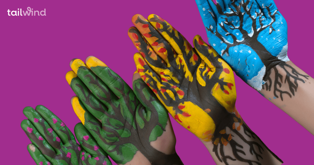
Let’s look at each of the four: Spring, Summer, Autumn, and Winter in more depth!
The 4 Color Seasons in Branding
Just like the four seasons of the year, seasons in color psychology are divided into Spring, Summer, Autumn and Winter.
As I mentioned before, each color season has its own characteristics that can help guide your branding choices — from colors to font choice, tone, and even props in your flat lay photography!
If you have no idea what your color season match is, you can start with this quick quiz to guide you in the right direction…or read about each of the four seasons below!
What’s Your Brand Color Personality?

The Spring Brand Season
Spring brand personalities are youthful, fun and creative. Like a best friend, this brand is zesty and spontaneous and always ready to have an adventure!
Here are some key characteristics of Spring personalities:
Spring Colors

Spring color palettes include light, bright and warm shades with slightly muted intensity.
Rather than bold neon hues, Spring favors rich pinks and corals, aqua, sunny yellows and bright, happy greens.
Colors should be sunny and playful but stop short of being too intense.
Spring Fonts
The Spring personality translates to font psychology, too! Font choices should be light-hearted and fun!
Bold, dark, and high-impact fonts won’t work well for this brand.
Instead, you’ll want to experiment with playful, flirty scripts and handwritten fonts, and clean, light sans-serifs.
There are fonts out there of every style and weight. So if you favor serif fonts, these can work for Spring too. Just remember that your font choice shouldn’t be too elegant or serious.
Spring Tone
The Spring personality tone of voice is fun, energetic and spontaneous.
Ditch the formal speech and focus on letting your warmth, charm, and bubbly personality shine through!
If you get stuck, think of yourself as a glass of champagne: bubbly and bursting with life…not to mention fun at parties!
The Summer Brand Season
You might think that Summer personalities are vibrant and colorful, but you’d be surprised!
Summer brand personalities are known for their romantic and graceful presentation. Elegant, soft and warm, these brands feel timeless!
Here are some key characteristics of Summer personalities:
Summer Colors

The summer color palette is soft, cool and muted. Most colors for summer are softened with a touch of grey — you won’t find bold yellows or reds in this refined palette!
Summer Fonts
Unlike Spring, Summer is right at home with quality, traditional Serif typefaces. Flowing script fonts also work well for Summer, highlighting the romantic, elegant side of this brand personality.
Summer Tone
Summer is about elegance and romance, and your tone should reflect that. However, just because your color palette may be cool, your tone doesn’t have to be!
Establish a warm, familiar tone, and work in words and phrases that evoke memories and the senses. Think of Summer like the pages of a good book: able to draw you in like a good friend!
The Autumn Brand Season
The Autumn brand personality is all about earthy, natural and warm. Oftentimes, brands with this personality don’t focus on material things but rather creating experiences.
Here are some characteristics of Autumn brands:
Autumn Colors

Like the season, Autumn color palettes are warm and intense, yet muted. Most colors in the Autumn color palette can be found in the natural world around us, a hallmark to their love of the outdoors and earthy disposition.
Autumn Fonts
Many fonts represent Autumn brands with incredible versatility. Serifs and impact fonts with texture and personality work well for this personality.
Sans serif fonts will be the least common font for this brand, as the smooth lines might feel too clean and lacking in personality for this organic brand type.
Autumn Tone
Autumn brand personalities are passionate and warm, and their tone reflects this. Whether you’re snuggling into a cozy couch for a fireside chat or encouraging your followers to step into their next great adventure, your tone should feel warm, friendly and encouraging!
The Winter Brand Season
Perhaps the most extreme of the brand personalities, Winter is all about drama, luxury and never settling for less. You’re bold, compelling and never compromise (or hide your amazing vision!).
You’ll find many high-end and luxury brands are Winter personalities, as well as most brands that relate to finances.
Here are some characteristics of the Winter brand:
Winter Colors

Your Winter color palette will be full of bright, intense shades. You’ll find hues with more of a cool edge here, just like the season, and each will be clear and crisp.
Winter is the only personality that black is recommended for as a color. It’s a striking contrast to bold colors and a powerful statement in any branding.
Winter Fonts
Winter brands are stylish, simple, and fashionable. Sans serif fonts or luxurious Serifs are frequently used by Winter brands, but you won’t find a basic Times New Roman here!
Instead, fashionable Serifs with varying stroke weights for drama are a fast favorite for this personality.
Winter Tone
As a Winter, you’re all about focus, drama and precision. You choose your words for impact and don’t waste a lot of time with flowery language or fillers.
You’re also a natural thought leader and have the confidence to make recommendations or present information without softening the edge. Be confident and precise, and let your statements stand for themselves!
Pin this for later: