Ultimate Pinterest Image Size Chart for 2022

Since Pinterest is a visual search and discovery engine, it is important to understand the best Pinterest image size options. After all, with the correct dimensions for Pinterest, your Pins are likely to perform better!

We’re here to help; that’s why we created the ultimate Pinterest image size chart anytime you need a refresher on Pin sizes for Pinterest.

This blog post will help you understand exactly what Pinterest Pin sizes you need for your Pinterest content! Plus, we’re covering tips, best practices, and helpful hints to answer your burning questions.

Ready to learn about all of the Pinterest sizes available for your Pins?

[sc name=”mnc-create-visual-cta”]

Pinterest Aspect Ratios At A Glance

Wondering what size Pinterest Pins should be? Here’s a handy list of aspect ratios to keep in your back pocket while you’re creating Pins. We’ll go into detail on each of these in the sections below!

With a platform that is constantly changing, here is our most recent update as of May 2022.

Pinterest Pins

  • Standard Pins 2:3
  • Square Pins 1:1
  • Long Pins 1:2.1
  • Infographic Pins 1:3
  • Carousel Pins 2:3 or 1:1
  • Collections Pins: 2:3 for first image, 1:1 for additional
  • Story Pins: 9:16

Pinterest Video Pins:

  • Standard Video Pins 2:3
  • Square Video Pins 1:1
  • Vertical Video Pins (Portraits) 9:16
  • Long Video Pins 1:2

Pinterest Ads Sizing:

Pinterest ads should be sized the same as the organic dimensions mentioned above.

Looking for some design inspiration? Check out Tailwind’s Pinterest templates page and see what your brand can do with Tailwind Create.

Pinterest Board Sizing

A Pinterest board cover should be about 600×600 with an aspect ratio of 1×1. The higher resolution the better, as these images will be larger on desktop and mobile than a regular Pin.

Pinterest Standard Pin Sizes & Dimensions

The ideal Pinterest image size is 1000 x 1500px and an aspect ratio of 2:3. In fact, Pinterest updated their own best-practices page to recommend 2:3 ratio. They clarify that “other ratios… may negatively impact performance”.

These Pinterest dimensions are recommended by the platform for standard size Pins, to guarantee the best Pin image quality possible!

Photo sizes should be a minimum of 600 x 900.

Pinterest says 1000 x 1500 is the optimal Pinterest image size, because if your image falls outside this ratio it could get truncated in people’s feeds and they won’t get to see your full Pin. Here are some examples of 2:3 Pin designs!

Pinterest Square Pins Sizes & Dimensions

The best size for Pinterest square Pins is a 1:1 aspect ratio and 1000 x 1000 px image size.

Ideal Use for Square Pins

This Pinterest post size is great for sharing your Instagram photos to your Pinterest account!

We don’t recommend creating Pinterest Pins this size unless you are sharing from another platform (like Instagram) or you can’t resize your image for whatever reason.

Remember, 2:3 standard Pin size is the best bet on Pinterest!

Pinterest Square Pin Size

Pinterest Long Pin Sizes & Dimensions

The best Pinterest long Pin size is 1000 x 2100 px with a Pinterest Pin ratio of 1:2.1.

1:2.1 is the best size for long Pins on Pinterest, because Pins with an aspect ratio that’s any longer than this will be truncated, or cropped in the Pinterest feed.

And beware! When your Pin is truncated, this can negatively impact Pin performance.

Pro Tips: To make sure your longer Pins still perform well if they are truncated, strongly consider creating long Pins with the text centered in the middle of the Pin. This still allows Pinterest users to get a preview of your Pin and it’s contents!

When they click on the Pin from their feed, they’ll see the full image!

Pinterest long pin size

Do You Want to Grow Your Business on Pinterst? Download our Free Expert Guide

Pinterest Infographic Pins Sizes & Dimensions

Using Infographic Pins is a topic of debate in Pinterest marketing communities for a few reasons.

  • One, long infographic Pins are not a recommended Pin size from Pinterest.
  • Two, infographics that are longer than 1:2.1 aspect ratio will get cut off in the feed.

As we mentioned in the section above about Long Pins, truncated Pins are negatively impacted in search, and have to get double the engagement to prove value to the algorithm.

But some bloggers say their best-performing Pins are infographic Pins!

Our take is that there is nothing wrong with testing them out (or any Pinterest Pin size) to see how well they support your Pinterest marketing strategy.

Just beware of the potential risks and consequences of using any Pin size that isn’t recommended (2:3).

With that in mind, the best dimensions for infographic Pins on Pinterest are 1000 x 3000 with a Pinterest Pin ratio of 1:3.

In general, creative best practices for infographic Pins are keeping it simple and easy to understand at a glance!

You can provide a ton of value to your target audience with this type of Pinterest post format. Just avoid the urge to overdo it (or pack too much text into one Pin).

You should also consider breaking long infographics into shorter pieces for multiple Pins! This helps you avoid cropping, and gives you more Pin content to work with!

Pinterest infographic pin sizes and dimensions

Related Reading : How to Add a Pin to Pinterest


Pinterest Carousel Pins Sizes and Dimensions

Carousels appear in the home feed just like other Pins, and can swipe through each carousel “card.” When a Pinner taps on the card, they can swipe through each card and the corresponding page you’ve linked it to!

Carousel Pins can be either standard Pin Size (2:3) or Square Pins (1:1).

When to Use Carousel Pins:

Pinterest carousel Pins are a great way to showcase different features or shots of a product, advertise multiple products or tell a Story!

Pinterest Collection Pins

If you’ve scanned the Product specs guide from Pinterest, you might find yourself slightly confused by the image size that works best here.

Pinterest says: “All creatives must have the same aspect ratio of 1:1 (square) or 2:3 (vertical). We recommend making your secondary creatives with a 1:1 aspect ratio to best control how they appear in people’s feeds. If the creative is not 1:1, the cropping will occur at the center of the image.”

First Image Sizing (hero image):

Essentially, you’re going to have to use multiple sizes here for the best fit in display. Your first image (hero image) should be the standard Pin Size of 2:3.

Pinterest Collection Pin

Additional Images:

After the hero image, any other images you add to your collection (minimum 3 and a max of 24) will display in a 1:1 aspect ratio. If you upload any images bigger than this they will be automatically cropped. Pinterest says this is cropped from the center, but when we tried it, it was definitely wonky! We recommend you play it safe and upload a square image to begin with.

So, to recap: for the first Pin image in your collection, use a 2:3 aspect ratio. For the rest of your images, use 1:1!

Pinterest Story Pins

Like Facebook and Instagram Stories, Pinterest Story Pins use the full-mobile screen aspect ratio of 9:16.

Story Pins can be static images or video up to 60 seconds long. Here are some other handy specs to keep in mind while creating your Pinterest Story Pin:

  • Max File Size: 20mb for images, 100mb for video
  • Length: 1-60 seconds long (video)
  • Size and Dimensions: 1080 x 1920 pixels, or 9:16

Pinterest Video Pins Sizes and Dimensions

Videos get a ton of action on Pinterest these days! There are many ways to create Pinterest videos, and there are different aspect ratios for video Pins on Pinterest.

The Pinterest size for videos include standard, long, vertical, and square. Here are the ratios for each:

  • Standard Video Pin: 2:3 aspect ratio
  • Square Video Pin: 1:1 aspect ratio
  • Long Video Pin: 1:2 aspect ratio
  • Vertical Video Pin: 9:16 aspect ratio

Rather than going off of Pinterest post image size, Video Pins have file specs and sizes to keep in mind when shooting for best quality. You’ll find the details below!

Video Pin Specs for Upload

  • The video length minimum should be at least 4 seconds but not more than 15 seconds on your Pinterest video Pin.
  • File size of no more than 2GB will work.
  • File types that work for video Pins includes .mp4, .mov and .m4v.
  • Encoding can be H.264 to H.265.

But What About Horizontal Videos?

You may be wondering about landscape videos on Pinterest. The truth of the matter is, this is not a recommended size for Pinterest video Pins.

Landscape video uploads are unlikely to work or work well as Pins. The exception to this rule, however, is max-width Promoted Pin videos!

Video Pin Audio

Most Pinterest users do not have their audio on when scrolling through their Pinterest feed, so try to create video Pins that do not rely on audio.

Instead, use your Pinterest video Pin as a “teaser” for the content you are sharing!

Video Pin Titles and Descriptions

Video Pin titles can be up to 100 characters long, with a Pin description up to 500 characters.

Keep in mind, the first 50-60 characters are most likely to show in people’s feeds. So make sure your description gets right to the point. And, remember to incorporate keywords for great Pinterest SEO!

Pinterest Profile Picture Size

When it comes to profile picture size for Pinterest, you’ll want to make sure the photo is clear and unblurred.

With that in mind, the best Pinterest profile pictures are sized to 160 x 160 px!

Pinterest Size Chart For Your Pins (Take This With You!)

Whew, that’s a lot to remember! Here is a handy infographic with a Pinterest size chart.

It’ll help you remember the best Pinterest dimensions and sizes for all your content!

Just right-click to save to your computer, or hover over the image to save it to your Pinterest.

Create Beautiful Pins with Tailwind!

Now that you know all of the Pin sizes out there, you can save time (and serious headaches!) by creating gorgeous Pin designs with one click!

Tailwind Create offers you hundreds of personalized Pin designs customized to your brand, industry and even content type! Just upload your photos, fill out your branding preferences and click the button!

Ta da – hundreds of uniquely you Pins perfectly sized for Pinterest at your fingertips. And, you can also schedule your Pinterest Pins using Tailwind, to save time and improve your Pinterest marketing strategy.

mprove your Pinterest marketing strategy.

mprove your Pinterest marketing strategy.

Grow your business on Pinterest with our suite of Pinterest marketing tools. Start your free trial today.

Pinterest Size FAQs

What is the best Pinterest image size?

As we mentioned previously, any 2:3 aspect ratio is ideal for Pinterest. Pinterest has validated this in a recent update to their best practices. They said that other ratios can “negatively impact performance”. 

[sc name=”mnc-create-visual-cta-abbreviated”]

Pin Pinterest Sizes and Pin Dimensions for Later :

Lifelong Hobby to Profitable Business: Meet Nana’s Crafty Home!

Nana's Crafty Home Case Study header

When Tonya Bush from Nana’s Crafty Home was growing up with four younger brothers, her mother enlisted the help of their neighbor and family friend, Dorthy, to teach Tonya how to crochet. And little did any of them know that Tonya would not only fall in love with crochet, but one day she’d take that lifelong passion and make a bustling career out of it entirely on her own.

Between making innovative designs for her children and grandkids, Tonya’s entrepreneurial spirit knew she had the talent and drive to take it far if she tried. And so, when the time came, she decided to bet on herself and leap into the unknown.

In Tonya’s words, “It was one of those moments where this is now, and if you don’t try, you’re going to regret it. I didn’t want to be looking back in 20 years and think, gosh, why didn’t I ever take that risk?” 

And so she went for it, and her biggest piece of advice – don’t wait so long to follow your dreams!

Tonya not only figured out website design, SEO, and marketing on her own (which she doesn’t recommend ), but she left her career of a 9-5 job managing two family practices with the goal of replacing her income within 5 years. A decision her prior employer questioned and half-jokingly said, “we’ll see you in a year.”

But as these interviews prove time and again, when you’re pursuing your greatest passion, something you have a raw talent for, you tend to be even more magnetic as the tenacity and enthusiasm helps give you an outcome that’s even better than you expected. 

It didn’t take Tonya five years to replace her income; she did it within one year and never looked back!

Tonya is fun, bubbly, charismatic, and you can feel the passion behind her business as she talks about her creative ideas, the friendships she’s made within her industry, and her desire to help everyone else succeed by following their dreams too. 

She believes that as long as we’re all following our dreams and pursuing our passions, there’s plenty of room for everyone to sit at the table. 

From a little girl with four younger brothers to a wife, mother, grandmother, and employee to a successful small business owner, I hope you find Tonya’s story as motivating and inspirational as I did.

Enjoy!

Nana's Crafty Home Case Study website

How did you first get started crocheting?

Tonya: I started over 40 years ago. So I’ve been crocheting for a long time. I had four younger brothers, so my mom, to help me escape the dinosaurs, He-Man, and GI Joe, wanted me to do something outside the home and learn something. We had a really good friend that lived down the street from us who we called Aunt Dorothy, and I would go over there every week and learn to crochet. She was a master seamstress, and she taught me how to sew and knit as well.

 I kind of got away from it when I graduated from high school. I got married, had kids, then grandkids, and I was like, wow, I really enjoy crocheting, so I started making gifts, blankets, baby blankets, all that good stuff. And it blossomed into what I’m doing now. So it’s been a journey.

How long did it take for you to start experimenting and making your own patterns?

Tonya: I’m a rule follower, and I never designed anything until the very first pattern that I released on my blog, and I designed it a month before my website went live.

Never having designed anything, I went straight for apparel. I went right from zero to 360 miles per hour.

It was a plunge, but it’s been a real learning experience for me. I’ve learned a lot about design, I’ve taken many classes, and I’m always learning more about how I can improve my craft. I think that’s what we should always be doing, trying to learn new things. I had never done a website before, and I had never done any of those things. So everything was new all at the same time. So that was a little stressful.

Nana's Crafty Home Case Study Facebook

What’s your favorite type of pattern to make?

Tonya: I tend to get quickly bored with doing the same thing over and over again. I don’t want to make the same thing more than once or twice. So this niche really fits my personality, but I tend to only want to design a certain type of thing once, and then I want to go onto something else. 

I tend to go all over the place, but I gravitate towards making things for my grandkids. Also, I love to make fashion accessories for myself. I love fashion. I love bags. I love all that stuff. 

So I kind of tend to gravitate toward designing those things. I like making works of art and blankets, tapestries, that type of thing, like telling a story. So those are the things I tend to gravitate toward, but I make all kinds. 

Nana's Crafty Home Case Study twitter screenshot

What lead you to start a blog and selling your patterns?

Tonya: Well, I worked in customer service for 30 plus years. And then, for the last 15 years or so of my career, I managed two family practice clinics. 

So I had a lot of computer experience. And I had a lot of experience working with people and building relationships. And I really felt like I wanted to do something for myself. 

At the time, I was 46, and it was one of those moments where I always wanted to have my own business, and it’s like okay, either you do it, or you shut up about it. It was one of those moments where this is now, and if you don’t try, you’re going to regret it. I didn’t want to be looking back in 20 years and think, gosh, why didn’t I ever take that risk? 

I worked full-time in my day job for the first year. And then doing this on the side is kind of funny because on the side is like 30 hours a week.

Getting your blog started, the domain, and learning SEO and all of the terminology behind all of it was like another language for me. It was hard that first year. It was really tough because you’re not really making any money, so you’re doing all this work, and you’re not seeing a lot of return or perceived return. 

And after a year, my husband and I sat down, I’m like, I can’t do this anymore. I can’t keep doing a stressful job like that and then try to come home and still have a home life and still see the grandkids and still do all of those things. It was just too much. So he said “look, just quit. I want you to quit your job, and I want to support you while you’re doing this.” 

We had a plan that I would hopefully replace my income within five years of quitting my job. And it only took one.

Tonya Bush

Lauren: That’s incredible. I love that you said you’re not much of a gambler, but if you’re ever going to bet on something, bet on your passion because that’s probably what’s going to bring you success.

Nanas Crafty Home Pinterest screenshot

How did you start your business and what did that process look like from beginning to now?

Tonya: So I was actually kind of amazed at how inexpensive it was to start. By the time I went live, I had spent like $200 total. I was trying to keep things as inexpensive as possible in the beginning. Trying to do everything as manually as possible, not paying a lot of money on different things. But then I started taking classes, and that’s where I invested my money.

I took a class on blogging and different things that I knew I needed to learn about. My photos were horrendous in the beginning. I’m just going to throw that out there. So I took a photography course which was a game-changer for me to learn how to use my camera.  

Those were probably the best things I did for my business, just constantly trying to learn as much as I could about the process. I knew nothing in the beginning, so I did a lot of things wrong, but you learn from those wrong things, right?

I don’t advocate people to do wrong things, but sometimes that wrong thing can help you learn how to do it the right way and once you’ve done it the wrong way, you’re like, I’m not doing that again. That first year, I learned so much about social media and how to cultivate that connection with people that I had learned throughout my customer service career. Making connections with individuals helped create a loyal following for me, particularly on Facebook. 

You can get sucked down the rabbit hole of social media. But I learned that you could make connections with people. You respond to people, and I started doing Facebook lives, and I would have regulars who would show up and share my patterns. And they’d ould sign up for my newsletter and send me emails. Every single person who ever emailed me I would always respond to.

And I think that’s what really helped grow my business was developing those relationships with people early on, and that loyalty just made it grow.

Tonya bush

I’m big on relationships, networking with other people, learning from other people as much as possible, and creating relationships in the business, whether they’re your colleagues, people from Tailwind, or just people. Relationships matter. 

How do you avoid burnout while wearing and maintaining so many hats? 

Tonya: For me, it’s trying to disconnect. I have a set work time, but I do like to be somewhat flexible for family. If there are appointments or activity  I want to participate in, I can work around that. 

But for the most part, I have a designated work schedule. I try to spend as much time as possible disconnecting to have a normal life outside of social media. And outside all of the business stuff.

And I do things for myself too like spending time with my mom, sister, family, and grandkids, just enjoying that time and trying to forget. 

It’s hard, though because there’s always stuff going on in the background as a business owner. It can be difficult to put that barrier between our personal and work life. But I do think it’s crucial.

I could be working 24-7 and still have things to do. There’s always something. 

Nana's Crafty Home Instagram screenshot

Looking back, is there anything you would have done differently?

Tonya: Probably started sooner. I wish I had done this like five years earlier. 

I would say the biggest thing would be not to get discouraged by the mistakes. You’re not going to do things perfectly, especially at the beginning. I mean, even now, I’ve been doing this for four years, and I still do things wrong. 

But if we get lost in the weeds of constantly regretting things that we’ve done in the past, we’re never going to be looking toward the future.

My biggest advice would be to learn as much as you can. Knowledge in your base, in your craft, whatever it is that you’re doing, whether you’re a food blogger or whatever, taking classes, investing your time and energy in learning how to make yourself better, even self-help. 

Learn how to be encouraged by the things that are going on in your life. I think that’s really probably the best thing that you can do for your business to be knowledgeable and learn.

You’re here and you’re doing this because you have an entrepreneurial spirit, and that’s big. I mean you’re just not willing to go with the flow, you want to do more, and I think that’s awesome.

Tonya bush

What do you like most about owning your own business?

Tonya: I love the flexibility of it. We touched on that before, too, working around my family’s schedule, spending time with my grandkids, fitting those things in that are important to me. 

From a personal standpoint, knowing that my success or failure is entirely dependent on me. I don’t get to blame anybody else for what happens. The harder I work, the more I do, the better I do, it’s all because of what I’m doing, and that is really empowering. There’s a lot of confidence-building in that, and I think when you start seeing the results of your labors, there’s so much confidence that you can gain from seeing those positive results, like wow, I’m making money doing this, I’m doing something that I’ve never done before. I took my passion, and I’m making money with it. 

It’s going to make you feel good about yourself, it’s going to make your relationships with your family better because you feel better about yourself. That’s probably the best thing about my business is that it made me really confident in who I am and where I’m at in my life, and I love it.

tonya bush

What advice would you give to someone starting a B2C business?

Tonya: I would say find others that are doing what you’re doing and make connections. This business can be isolating. We sit at a computer, I’m at home with my dog and my cat every day. I only know one other person personally that does this for a living. 

It’s difficult because we’re used to having those conversations with people in social settings. You talk about what you do at work, and you can bounce things off of others because even if they’re not doing exactly what you’re doing, it’s similar enough that you can have a conversation. Most people look at me with this quizzical look on their face like, you do what now? You make money doing that? Someone pays you to do that?

One of the best things I did at the beginning was finding other crochet pattern designers in groups that do what I do. They design patterns, blog, sell patterns, do all of those things, and so you feel like you can have a conversation with them, ask questions, and get their opinion. You’re able to build relationships with people who are in a similar niche and spend time really picking each other’s brains about becoming successful at what you’re doing.

From a business perspective, what made you decide to use Tailwind?

Tonya: So remember I talked about how cheap I wanted to go initially, and how that can be your detriment? Honestly, I resisted Tailwind for the first year of my business, and I was manually pinning on Pinterest every day.

It was insane. I would set my timer, and because I didn’t want to do like 30 pins at once, I would do five in the morning, ten in the afternoon, and then again in the evening. But I was spending way too much time doing that, and a lot of people in my crochet group talked about Tailwind and how much it had helped them. And they were networking a lot with the communities that Tailwind had, and I thought, wow maybe this is something I need to do. I need to figure out a way to free up more of my time, so I’m not wasting it.

Tailwind was an instant game-changer. I was like, what did I wait for? The ability to schedule out pins, pin to multiple boards. One of the things I couldn’t figure out, in the beginning, was why I couldn’t get any of the other crochet pattern designers to follow me on Pinterest? My Pinterest account was growing, but it was usually individual people, three, five, ten followers, whatever. But I kept wondering where all the crochet pattern designers were? None were following me, and they don’t pin any of my stuff. 

Well,, it’s because they were all in the Tailwind tribes, and they would only pin from Tailwind. So if you weren’t in Tailwind, they didn’t see your stuff, and it was like you didn’t exist to them because your pins weren’t where they were looking.

And that was like a game-changer, because then well-known designers who had been established were now pinning my things, and they were pinning them to these larger boards that had tons of followers. Some of these designers had a million followers, and that really grew my account too. 

I really started gaining a lot more followers when I went to Tailwind because my pins were being seen by a lot more people.

That’s actually one of my regrets, not joining Tailwind sooner.

tonya busH

What’s your favorite Tailwind feature and why?

Tonya: Oh, definitely Create. That was a complete game-changer for me. I am not a graphic designer. 

That was probably one of the worst things for me was trying to figure out what a good pin looked like. When that create feature came out, it was like the sky opened, the sun shone. I was like, where has this been all my life?

I started using it immediately, and it was so fast and easy. I could download the pin I wanted, send it to my communities for them to access, and schedule it all simultaneously. 

From that standpoint alone,, I think Tailwind is worth it just for the Create feature because I spend so much less time worrying about my Pinterest pins and the design aspect is just so easy. 

My biggest trouble now is which pin to pick. There’s all these choices, and you can arrange the photos differently and everything, so oh my gosh, which one am I going to pick?

Nana's Crafty Home Instagram screenshot

What’s next for Nana’s Crafty Home?

Tonya: The sky’s the limit. I’ve had some great things happen over the last year with my business. Two of my designs have been featured on the front cover of a magazine. So that brought me a lot of exposure and more into mainstream media, which has been awesome. 

And because of that relationship with them, it blossomed into their social media manager reaching out to me, so now I’m doing a Facebook live tutorial for them every month, and that’s helping me reach a lot more people. 

So I’m really just hoping that I continue to have those opportunities to show what I do and teach people. That’s really my passion to teach people who want to learn more about crochet and to find them wherever they might be.

Where you can find Tonya Bush from Nana’s Crafty Home

Want to check out Tonya’s one-of-a-kind patterns? You can find them on her website. And she even has a lifetime membership where you can have access to every single one! 

You can also stay up-to-date with Nana’s Crafty Home on Facebook, Twitter, Pinterest, Instagram, and YouTube

I hope you all found Tonya as inspiring as I did. 

Later, alligators.

[sc name=”pin-me-tailwind-create-cta”]

Tonya Bush left her 9-5 job with one goal - replace her income within five years and she did it in one! Find out how she built a thriving business!

How to Design Your Social Media Posts Like a Pro (with Tailwind!)

Without formal design training, creating social media designs for multiple platforms can seem like a really intimidating task. Especially if it’s up to you as a small business owner or marketer (without a design team to back you up) to have a presence on these digital marketing platforms!

The good news is that it’s not as hard or as time-intensive as you might think to generate consistent content across all your favorite platforms like Pinterest, Instagram, and Facebook. 

In fact, all it takes is a few clicks in our Tailwind Create tool!

Let’s dive into exactly what it takes to fill your social media content calendar with branded designs for each of your platforms.

But first, we’ll spend some time on why branding on social media is so important for small businesses – and how establishing your branding guidelines early on will make this process even faster!

[sc name=”mnc-create-visual-cta”]

Why Brand Your Social Media Posts?

We’re so glad you asked. Most people know that from a business perspective, your posts should be branded. But you might not understand exactly why it’s important! That’s okay, we’ll break it down:

Branding Your Social Posts Helps Communicate Your Story and Personality

Humans take visual cues from just about anything they look at. For example, color psychology is a very real science studying how people react to different colors and the emotions that they invoke.

Fonts also evoke emotion and give people a very real impression of who you are and what you’re about from their computer or phone screens. Careful choices in color, font, and design elements can act as a calling card for your personality, without you ever saying a word!

Branding Your Social Posts Creates Brand Recognition and Awareness

Think for a moment about how many posts you see scrolling through your timeline or feed on social media platforms. 

Now, think of one or two of your favorite brands or accounts. Can you immediately pick out a post from one of these accounts in the feed without reading the caption? Chances are, you can. This is because you’ve been exposed to this brand often enough to immediately recognize their signature designs!

Firming up your branding and sticking to it will create this same instant recognition among your followers. That in turn builds trust and loyalty.

Branding Your Social Posts Helps Prevent Content Theft

Honestly, it’s a bummer that this has to make it on the list, but it’s true. When you hit publish on your designs, that means they’re ripe for the picking on the web. Other users on social media can easily save and use your unbranded designs as their own content.

When you add your website, your company logo, and even recognizable details from your branding like fonts and colors to the social media designs you publish, it becomes a lot harder for other people to pass them off as their own.

If you’ve worked hard on your designs, your content, and your business, you definitely don’t want someone else to get credit! That’s why we recommend branding your social posts – especially graphics.

How to Brand Your Social Media Posts with Tailwind

So now you know why you should be taking the time to brand your social media posts – now let’s talk about how you do it with Tailwind! It all happens in just a few quick steps. 

Once you’re in your Tailwind social media management dashboard, take a look at the left-hand menu. You should see a paintbrush icon – this is our powerful design tool, Tailwind Create!

Before you dive into designing your social posts, you’ll want to set up your branding tools. Click the paintbrush icon, and then select Brand Settings from the top menu.

Step One: Add In Your Website or Brand Name

You can enter your company name (ex: Sample Company) or website (ex: www.samplecompany.com).

This will be automatically generated on all your designs in Tailwind Create, as well as your logos (more on that later!)

Brand Settings view in Tailwind Create

Step Two: Select Fonts, Or Upload Your Own!

Tailwind Create has dozens of fonts to choose from to craft the perfect font pairings for your social media designs.

Just browse our available fonts for your title font and subtitle font.

If you need inspiration, check out our curated font pairing choices! Or, upload your custom brand font files if you have them handy!


Step Three: Choose Your Brand Colors

Now that you have your fonts all squared away, you’ll want to add your brand colors into Tailwind Create. This ensures that all of the designs in Create are personalized with your brand colors – talk about cutting down design time!

Choosing your four brand colors in Create is super easy to do. If you know the Hex or RGB codes of your colors, just click on each colored circle and copy and paste. You can also move the dropper tool around until you find the perfect shade!

Tailwind Create also has tons of curated color palettes to browse! If you’re a big believer in seasonal color theory (we are!), you’ll love the curated palettes for the seasons!


Step Four: Upload Your Brand Logos

The final step in your journey to creating perfectly branded social media posts in Tailwind Create is to upload your logos. This is an optional step if you don’t have a logo, but gives you more flexibility with the presentation of branding on your designs!

Upload 200 x 200 pixel logo files by clicking the grey plus sign icon. Make sure your files are .pngs, so the backgrounds of your logos are transparent and can be overlayed onto your design with ease!

Pro Design Tip: Upload your logo in a few different colorways so that you have plenty of flexibility. For example, Tailwind has a blue and a white version of our logo, so that we have plenty of contrast and visibility on every design!


How to Design Your Social Media Posts with Tailwind

Now that you’ve done all the legwork of inputting your brand settings into Tailwind Create, it’s time for the fun part! Creating the perfect social media designs with Tailwind is so easy. In fact, you’re starting from almost done with each design already personalized to your brand as soon as they cross your screen!

Here’s how it works!

Step One: Upload Your Photo

Head on over to Design Gallery, and upload the photo or photos you want to create designs for. If you don’t have a photo handy, you can browse our library of Stock Photos!

If you want to use photos from your website, enter the URL of the page you’d like to pull from.

Available images from that page will populate below, and you can select the ones you’d like to use!

You’ll notice designs start to populate in the gallery with your selected images. You can select any that catch your eye or use the smart filters in our design gallery to find designs matched to your industry, type of content, number of photos, and favorite social platforms.


Step Two: Filter Designs By Your Industry (And More!)

With your photos in place, it’s time to personalize your Tailwind Create designs even more! Take a look at the top menu options above your Design Gallery. You’ll see Post Types, Photo Count, and Categories.

Post Types allows you to see your designs for specific platforms – you’ll find options for Instagram Feed Posts, Instagram Stories, Pinterest Pins, and Facebook Feed Posts here.

Photo Count allows you to preview your creations based on how many photos will be included in the design. You can see design options for “multiple photos”, “one photo”, “no photos”, or “any number of photos” here.

Category is where you can narrow down your design styles based on things like:

  • Content (is your post about a product, a blog post, a quote?)
  • Promotion (is this an ad design, an announcement, or a contest?)
  • Industry (are you in the animals & pets, entertainment, fashion, or travel niche?)
  • Style (is your brand modern, minimalist, artistic or festive?)
  • Seasonal (are you designing for Spring, Summer, Fall or Winter?)

Choose the filters that best fit the content you’re looking to create on social media, and watch personalized designs based on your choices fill the screen!


Step Three: Review Your Designs and Make Necessary Tweaks

Now that you’ve got hyper-specific social post designs customized to your brand needs, it’s time to pick your favorites and make any tweaks!

Hit the Photos button to see the design with your other photo selections, or to rearrange the placement of multiple photos in a design.

Hint: this will only work if you’ve selected more than one photo in Step One!

Hit the Layouts button to see the design in different layouts. You’ll see several different options for text placement, picture placement, and justification.

Hit the Colors button to see the image with different combinations of your brand colors. To the right, you can see the different choices from the uploaded brand fonts being used in the element and overlay colors!

You can also click the Edit button to make more in-depth tweaks to your design. You can add additional text, add or remove design elements, or make changes to your photo if your original selections just aren’t working the way you want them to.

In this screen, you can also physically move around any elements of the design!


Step Four: Review Your Branding

Before you’re done creating your social media designs, check your branding one more time. Thanks to the work we did putting in our brand settings above, you should have some options in your Design Settings!

Click on the Branding heading to see branding options for your designs.

You can set your Website or Brand Name to automatically populate on all your social media designs. If you’d rather use your logo, select Logo and the version you’d like to work with.

The designs in your gallery will automatically update with your choices, so you have full power over how your social media post is branded, every time!


Step Five: Select and Schedule Your Social Media Posts

As you finish reviewing and tweaking each of your favorite designs, you’ll want to hit the Select button under each to save them! You can search for new designs, edit and select them one after the other – no need to interrupt your workflow to review and download until the end!

Once you’ve finished designing to your heart’s content for all your platforms, hit the big green Review button in the bottom right corner of your screen. This will show you all of your selected designs, and allow you to do a final check.

If you feel like you need to just move that one thing in order to have a picture-perfect post, just hit the edit button and get that tweaking out of your system! Your designs will still be there waiting for you on your Review screen.

When you’re ready, return to this screen and either download all your images by hitting the download button, or tap the green Go Schedule button to seamlessly send your designs to your Tailwind social media scheduler drafts. It couldn’t be easier to create your social media posts, schedule, and post them with this workflow! ✨

Have any questions about branding your social designs or using Tailwind Create? Drop them in the comments below – we read every one!

[sc name=”mnc-create-visual-cta-abbreviated”]

[sc name=”pin-me-tailwind-create-cta”]

Read our guide for in-depth tips on branding and designing your social media posts - and find out why branding social media posts is so important!

10 Pros Reveal How to Create Scroll-Stopping Images for Social Media

When your business relies on getting quality traffic from social media, you spend a lot of time crafting the perfect images.

But there’s nothing more depressing (or infuriating) than spending precious time designing something beautiful only to have it overlooked or ignored.

If you’re not a professional designer or marketer, knowing what kinds of graphics will make people pay attention can be hard. In fact, even many designers and marketers are often left scratching their heads when their images just don’t connect.

Today, our goal is to help you understand what it takes to create and post scroll-stopping images for social media. 

We’ll focus primarily on Pinterest, Instagram, and Facebook—but these strategies can be adapted and used on a wide variety of platforms including sites like YouTube or your own blog.

The advice in this post comes from a very talented group of professional designers and marketers who have been in the trenches and know what it takes to get their followers’ attention.

So if you want your flowers to STOP and pay attention to you in their social feeds, this roundup of top-notch advice is for you.

Let’s get started:

Tip #1: Follow the Data

We’re starting with this tip because it should literally affect every decision you make about social media design moving forward.

If you’re a true marketer or entrepreneur, data and analytics are the most important things to consider when designing for social feeds.

Ask yourself: What are users actually engaging with?

From there, any other questions about brand consistency, colors, fonts, and images all take a back seat.

“Start out by experimenting with different types of images for your content– different colors, fonts, image types, etc– and find what people are engaging with the most (Pinterest analytics are an INCREDIBLE resource for this!)– and then use that data to make informed decisions about what kind of images to create moving forward. “

Morgan Nield, Marketer and Entrepreneur

Tip #2: Optimize for Each Platform

Just because you’ve got a good understanding of what it takes to succeed on Pinterest, doesn’t mean the same tactics will work on Instagram.

In fact, they’re almost guaranteed not to.

“It’s essential to make sure that the social media designs adhere to each platform’s size and resolution requirements so that your posts look just right,” explains marketing & design expert Amalia Madalina Pop.

But optimizing your designs for each individual platform is about way more than just getting the right social media image sizes (although, that is definitely important).

It’s about understanding why your followers are using one platform over another.

“It is essential to understand which platforms are suitable for your business,” Amalia continues. “While Pinterest is one place to find inspiration that leads to purchase, LinkedIn is a more business-oriented platform.”

“Every platform has its specificity. Pick those platforms that will shed the best light on your product or services with the help of social media graphic design.”

The design team at Design Pickle agrees:

“Identify which platform(s) you’re going to share your designs on before starting the design. You’ll have to resize the image to fit the specific dimensions of every platform you plan to share a social media graphic design.

It may seem tedious, but a quick size check could make the difference between cropping out the most important design element and a flawless user experience.”

For more information, review how to recycle social media content for multiple platforms.

[sc name=”mnc-create-visual-cta-abbreviated”]

Tip #3: Tap Into Emotion with Faces

Visual communication is all about emotion: what do your followers FEEL when they see your social posts.

The more emotion you can build into an image or design, the more likely your followers are to stop scrolling, pay attention, engage, or click.

“Use emotion or motion in the images.

This means if you’re going to use someone’s face, make sure there is obvious emotion vs just using a standard smiling headshot.” 

Clay Mosley, GetDripify

Studies show that using faces in your social media images can lead to more likes

The overall goal here is to get your followers to feel something when they see your graphics. The more they feel, the more connection they will have with your brand, and the more likely they’ll be to engage in positive ways.

Tip #4: Don’t Be Too Polished

Our next design tip for scroll-stopping images has proven to work especially well when designing facebook images (particularly for ads).

Our advice? Don’t be too polished.

“It may seem counterintuitive at first,” explains designer and marketer Preston Lee, “but sometimes a ‘poorly designed’ image can grab a LOT of attention.” 

“You should balance this decision with other considerations like your overall brand appearance, but often, if your posts are too polished, they’ll fade into the background and get swallowed up by all the noise in your followers’ feeds.”

The reasoning behind this is pretty simple:

If an image is over-optimized it can begin to feel too “corporate” or “cold” where a less “official” image can feel authentic, warm, and original.

Tip #5: Provide Additional Value

When designing images for social media, it can pay off to ask yourself “how can I add even more value here?”

Studies show people come to social media for “reward processing, social cognition, imitation, and attention.”

In other words, people come to social media looking for something. Attention, validation, and often information.

Pro designer Amy Kuo reveals how she boosts engagement through social images:

“Share your knowledge! My most engaged-with posts are clear, well-designed graphs or carousel posts sharing bits and pieces of my knowledge about branding and design.”

It’s the same with interior design expert Mania Mavridou.

“My personal goal is to connect my architectural studio with professionalism and great taste, but also provide value, showing my expertise and educating prospects and clients,” she explains. “This is why there’s always some text, an attention grabbing story or useful information, and a link to a blog post for those who want to learn more.”

Tip #6: Master Composition & Hierarchy

Every social media graphic or image should tell a story. And, indeed, each one does whether you intend it or not.

The real challenge is telling the right story in a fraction of a second as your followers are scrolling through their feeds.

For that, you’ll want to harness the power of good composition and hierarchy.

“To create attention-grabbing images, you’ve got to create an engaging composition,” says pro designer Matt Olpinski. “Your graphic can be text-based or image-based, but the composition (or layout) has to captivate the user.”

Great composition starts with getting users to see the most important messages first. This is called hierarchy.

Brian Peters, a marketer working at Shopify, explains the power of hierarchy in your social designs:

“It’s quite likely that you’ll be working with multiple elements in your social media design. And chances are each of those elements will be important to your overall message.

Taking full advantage of the hierarchy design principle starts with an understanding of your goals. Establish the most crucial message as the focal point and … once that’s in place, you can start to build your second or third pieces of information in without taking away from the overall goal.”

To get a better grasp on hierarchy, try reading our guide to visual hierarchy for non-designers!

Tip #7: Don’t Make it About You

When designing your next social media post or capturing that next great image, you might be inclined to focus on you, your brand, and your message.

That makes sense. But taken too far, this can be a big mistake.

“Given that social media is designed for publishing YOUR words and YOUR pictures, it can be tempting to make it about you.

Your audience chose to follow you for a reason. Whether it’s for information, entertainment or inspiration, your job is to give the people what they came for.”

Jamahl Johnson, 99Designs

While many of your followers have chosen to click that “follow” button because they want to see what you’re up to, keep in mind: almost all of us are narcissists to one degree or another.

Even if they’re not asking it consciously, when someone follows you on social media, they’re wondering: “what’s in it for me?”

Make your social media graphics about your followers, your users, your customers, and their needs.

Getting Users to Stop Scrolling

In the end, this advice from top marketing and design experts is a great starting point to get users to stop scrolling through their feeds and pay attention to you or your brand.

But let’s come full circle here, back to tip #1 at the top of this post: follow the data.

Take this article and test, experiment, track, and review results. Then take what’s working and do more of it, discarding the ideas that don’t work.

You can also hone in on your own style and strategy for social media design with a little help! With Tailwind Create, you can generate hundreds of show-stopping designs personalized to your brand for your favorite social media platforms. From Pinterest Pins to Facebook posts and everywhere in between, Tailwind Create is here to help you start your social media designs from almost done. Try it out here!

[sc name=”mnc-create-visual-cta”]

[sc name=”pin-me-tailwind-create-cta”]

Want scroll-stopping images on your social accounts? 10 pro designers and marketers reveal what works best to boost image engagement and clicks.

Do’s and Don’ts of Pinterest Pin Design

A Pin with 5 Graphic Tees Perfect for Spring with arrows indicating important parts of the design against an orange background

Designing Pinterest Pins is an art and a science. There’s no one right way to do it, but let’s be honest; there are plenty of wrong ways to do it!

If you want to catch the eye of your target audience while they’re scrolling through hundreds of Pins per minute, it really helps to know a little something about aesthetics and design.

But don’t worry, you won’t have to go to art or design school to learn the tricks you need to know!

Take a look at a few of our Do’s and Don’ts of Pinterest Pin design to help you find the most success when creating Pinterest Pins.

Pinterest Design Do’s:

1. Pay Attention to What Colors Go Together

If you’re unfamiliar with the color wheel, it’s time you get acquainted. The color wheel can help you when designing pretty much anything by showing you which colors go best together, and the different combinations you can use to make your own color palette.

Having this handy whenever you’re designing Pinterest Pins can help you decide which colors to use for your Pin (and avoid colors that don’t quite mesh well together).

2. Choose Fonts That Go Well Together

Just like colors, fonts have pairings that go very well with one another. You’ve just got to know which font pairings work well on Pinterest Pins, and which ones don’t!

But don’t worry, it’s not rocket science. In fact, here are a few to get you started! (And if you have a little extra time, check out our post on Font Psychology to learn more about each font family and what effect they can have on your viewer!)

Fonts that Go Well Together

Usually it’s better to pair San-Serif fonts with Serif fonts. The contrast makes the Pin look fresh and modern without distracting the viewer!

  • Open Sans Extra Bold and Libre Baskerville
  • Ubuntu and Lora
  • Playfair and Josefin Sans
  • Oswald Heavy and Merriweather
  • Montserrat and Cardo
  • Nunito Black and Lora
  • Oswald Heavy and Old Standard TT
  • League Spartan and Libre Baskerville
  • Open Sans Extra Bold and Lora
  • PT Sans Bold and PT Serif
  • Lato Heavy and Merriweather
  • Montserrat and Playfair Display
  • Raleway Extra Bold and Merriweather

Of course, you can always go the Serif/Sans-Serif Route, too. Take a look at some suggestions.

  • Cardo Bold and Josefin Sans
  • Merriweather and Source Sans Pro
  • Roboto Slab Bold and Open Sans
  • Lora and Source Sans Pro
  • Libre Baskerville and Montserrat
  • Roboto Slab Bold and Roboto
  • Playfair Display and Open Sans
  • Merriweather and Open Sans
  • PT Serif and Open Sans
  • Source Serif Pro and Source Sans Pro

Perhaps you want to use a script font, which is a popular choice for a lot of bloggers.

  • Yellowtail and Open Sans
  • Abril Fatface and Josefin Sans
  • Lobster and Arimo
  • Shadows and Roboto
  • Pacifico and Arimo
  • Sacramento and Montserrat Light
  • Lobster and Open Sans
  • Pacifico and Josefin Sans

3. Use High-Quality Images

One major aspect of Pinterest Pin design is the image. It’s all about the image on Pinterest. If your Pinterest images aren’t up to par, you won’t get nearly as much traffic as you could be getting.

Because Pinterest is all about images, you need to step your image game up and either take your own stunning high-resolution photos, or get some professional stock photos.

The best option is, of course, to take your own photos so that they’ll be unique and you know no one will have the same Pin image as you. You can even take amazing Pinterest photos on your phone!

But if that’s not an option, the stock photos are a great option. If you want images that not everyone has access to, consider using photos that require a license.

Just be careful about the ways you can use the photo. Make sure to read all of the requirements (like attribution requirements it might have) before you use it in anything. Otherwise, you could get fined or be forced to suddenly stop using the photo.

4. Use a Pinterest Template

If you know absolutely nothing about Pinterest Pin design, take a few pointers from the pros and use a template designed by an actual graphic designer. With design tools like Tailwind Create, you can find dozens of Pinterest templates that you can use to get you started.

Pick a few you like and play around with them until you’re satisfied with the way they look! You can filter templates by content type, industry and even number of photos!

[sc name=”mnc-create-visual-cta-abbreviated”]

Pinterest Design Don’ts:

1. Ignore the Description 

While it might not seem like a part of the design, your Pin description is still crucial to your success on Pinterest. The best descriptions use keywords (think Pinterest SEO) and describe accurately what the Pin is about and what people will learn about or what they can get if they click on it.

Make it juicy, though. Hold nothing back because you’ve got a lot of competition. So bring your A game when it comes to writing the description!

Be descriptive, but playful. Let your personality come alive through the words you write.

2. Forget About Branding

Branding on Pinterest is just as important as branding on your website. Remember to add something that shows off who your brand is and gives people something to remember.

There are a few ways to incorporate branding into every Pin design without limiting the actual creative style of the Pin.

The easiest ways are to use your brand colors, and add your brand logo to your Pin. If you don’t have a logo, add your website somewhere on your Pin.

3. Be Afraid to Experiment

Pinterest Pin designs are going to evolve over time as new design elements become more popular and other ones fall out of fashion. For example, minimalist Pin design is a current trend!

So, don’t be afraid to experiment with design elements and ideas you think might be making their way to the forefront of things. That way, you’ll already be ahead of the curve and people will look to you for inspiration. If you need inspiration, check out our 2021 Pinterest Trends Report!

How cool would it be to be featured on a list of Pinterest Pin designs that did it right?

4. Forget the Call to Action

Speaking of calls to action, don’t forget that either. Otherwise, what’s the point of Pinning on Pinterest? The goal is to get people to buy something, download something, or try something. So make sure you let them know exactly what it is you want them to do.

Some call to action ideas include:

  • Leave a comment if…
  • Share this with your friends
  • Pin this now
  • Make this
  • Click here to become a…
  • Sign up and discover how
  • Does this happen to you? Find the answers by clicking here…
  • Not getting the results you want? This can help…

If you want to create scarcity and urgency, here are a few more for you.

  • Hurry
  • Today only
  • While supplies last
  • Time’s running out
  • Are you doing this wrong? Click here to find out.
  • Last chance to get this
  • Only X days left
  • Don’t make this huge mistake – fix it by…
  • Act now
  • Fast
  • Immediately

5. Forget About Cool Design Elements That Boost Engagement

One design element that can boost engagement is an arrow that points to your call to action (CTA). Using one of these can drive up your click through rates.

Not only should you include a CTA in your Pin design, like “Get This Look!” or “Shop Now!”, you can also add design elements like arrows to draw the eye to the CTA.

Creating Stunning Pinterest Pins with Ease

Creating beautiful Pins doesn’t have to be quite the headache you imagine. In fact, it can be pretty fun and easy with the right tools, like, say, Tailwind Create. With Tailwind Create, you can create gorgeous Pinterest Pins that really pop. Go preview dozens of design ideas you can personalize and brand to make your own!

[sc name=”mnc-create-visual-cta”]

[sc name=”pin-me-tailwind-create-cta”]

When designing Pinterest Pins, there are some do's and don'ts to keep in mind. Find out what you should be doing to make a Pinterest Pin here!

Essential Guide to Pinterest Templates (Make Your Pins Pop!)

An image of an editable purple Pin template in Tailwind Create with a girl in a purple shirt sitting on a ledge

Pinterest templates are an incredible resource for marketers looking to promote their products, ideas and content on Pinterest without spending a ton of time branding and styling Pin designs from scratch.

This isn’t to say all your Pins should look the same; you should always be creating fresh Pins and content for Pinterest. However, a set of well-crafted templates can help you create beautiful Pins that showcase your photos and content while keeping your branding intact.

A good way to think about this is having a set of templates for every type of content you produce.

Whether you’re designing Product Pins, promoting a blog post, or sharing a quote, you should have at least 1-3 Pinterest template designs suited to that format. That way, you can customize a set design around your photo and content – not the other way around!

Plus, having multiple Pinterest templates available (for, say, promoting your blog post) means that you’ll have visual variety for your created Pins. If you have just one template that you use, your Created tab on Pinterest is going to look awfully boring!

Ok, now you know why Pin templates can really help your boost your Pinterest marketing. Let’s dive into the specifics of what to include in Pin templates. We’ll also go over where and how to make them!

[sc name=”mnc-create-visual-cta-abbreviated”]

What to Include in Pinterest Template

One of the main advantages of creating Pinterest templates is that you have branded resources for promoting your content and products on Pinterest at your fingertips! And, they’re fairly easy to make!

Here are the main elements you want to include a space for in your Pin design:

  • Pin image
  • Pin Title
  • Subheading and room for copy
  • Background
  • Additional Design Elements
  • Branding 
  • CTA

You’ll also want to make sure that your branding is emphasized throughout your template.

This means incorporating your color palette, branded fonts, and a logo or website!

How to Create Pinterest Templates

There are a lot of design tools out there you can use to make beautiful Pin images, like Canva, PicMonkey and editable templates purchased from Creative Market!

You’ll simply choose a design you like, and customize the elements of the Pin to match your image and branding. In order to create a robust Pinterest template library, you may have to spend a few hours hunting for your favorite designs that work for your content types and then customizing each with your branding.

Or, you can start from almost done with Tailwind Create! 

Our smart visual designer will generate templates in one click based on your industry, branding, or even the color palette of your photo!

It’s a huge time saver, and helps you generate thousands of personalized designs for Pinterest (and your other social platforms!) in half the time. 

Here’s how to use a personalized Pinterest Template in Tailwind Create, step by step and save hours of design time:

Designing multiple Pin templates with Tailwind Create tool
  1. Add Your Pin Title
  2. Add the web address you want to pull your photos from or upload them from your computer
  3. Click Create in the bottom right corner
  4. Browse thousands of curated Pinterest templates generated with your images, title, and branding
  5.  Filter the list by photo count and/or category to find the perfect template for your Pin
  6. Click Edit to make changes to photos, text, color, or branding on any Pinterest template
  7. Select your favorite personalized Pin designs, and hit Review Selection in the bottom right corner when you’re done
  8. Download your Pin images or click “Go Schedule” to add them to your Tailwind Pinterest scheduler

It couldn’t be easier to create personalized social media posts in half the time with Tailwind Create. See what others have created with our tool!

How to Stand Out on Pinterest with Beautiful Pins

When building or using Pinterest templates, there are a few tips and tricks you’ll want to keep in mind on how to make your Pinterest Pins beautiful!

1. Choose a Professional-Looking Image

Image quality is key when it comes to Pinterest Pins. After all, would you click on a Pin with blurry, pixellated images, or snaps taken in low-quality lighting?

Clear, crisp images draw Pinners’ eyes, and showcase your products or topics really well in the busy Pinterest feed! They help tell a story – maybe even before your viewer reads the Pin Title – and can make or break the decision to click.

And, did you know that you can get professional-looking pictures for your Pins right on your phone? Check out our FREE phone photography webinar for more details!

[sc name=”ivory-mix-webinar-evergreen”]

2. Choose Your Pin Background

Next, you’ll want to choose the background of your Pinterest template. Generally, when you create a Pin with a large block of text, you want to choose a background that doesn’t distract from the text or make it difficult to read – like a solid background color. Minimalist Pin designs work particularly well for this! 

Images can also make for good backgrounds to Pins without a lot of text. You’ll want to choose a simple photo for your background, with plenty of white space for your copy.

If your photo doesn’t have white space, consider adding a text overlay to your Pin so that the text is clearly readable. You should also make sure your text is high enough contrast to be easily read on a screen.

This not only helps your Pinterest audience, it helps Pinterest itself understand exactly what your Pin is about!

3. Draw Users in With Pin Titles

Pin Titles tell your users exactly what your Pin is about – and did you know they tell Pinterest what it’s about, too?

Pinterests’ visual AI tool can read the text on your Pin – well, some text. It really struggles with script and handwritten fonts, so even though these are cute, they don’t help Pinterest SEO.

And trust us, you really want to optimize your Pin designs with Pinterest SEO in mind. When the algorithm (and your users) have a clear understanding of what your Pin is about, it will surface in relevant search results for Pinners interested in that topic. That’s more eyes on your content, and more traffic to your site!

To make a design-friendly Title that hits the points of Pinterest SEO, include your main keyword or topic in your Pin Title, and fight the urge to make it too long. A short, snappy title doesn’t detract from your Pin image or take up too much space in the design, while getting the point across.

You can use up to 100 characters in your Pin Title! 

4. Include Your Branding on the Pin

If you think about it, the Pinterest feed is filled with hundreds of Pin images side by side, each inviting Pinners to click and learn more. If you’re interested in building engagement and a loyal following on Pinterest, subtle branding touches on your Pin can help!

If you have a brand logo, consider including it on your Pin in the corner, or at the bottom of your Pin. 

If you don’t have a logo, include your website address. This helps users know who made the content, and where to go for more things like it!

Want more information? Read our in-depth guide on creative best practices for Pin design!

Pinterest Pin Template Examples from Tailwind

How Often to Post on Pinterest?

You may be wondering how often to post on Pinterest, and looking for information on the best days to post on Pinterest. Well, we have some good and bad news for you here!

The bad news is there is no best time to post on Pinterest. The good news, is that any time could be a good time to post on Pinterest. The key is not posting at the right time and date, but perfecting your Pinning consistency. Here it is from Pinterest themselves:

It’s a good idea to save Pins regularly—consistent, daily activity is better than a once-a-week flurry. Be patient and stick with it.

Unlike social networks where all of your audience reach typically happens in the first 24 hours, the reach of your content on Pinterest will continue to grow over time as Pinners discover and save your Pins. Publishing consistently over consecutive months is the best way to build a dedicated audience.

Pinterest

Our recommendation is to look at how much time you have to commit to generating content to Pin, so that you always have a consistent flow of Pins to your boards.

“There’s no point in pinning 100 times per day if you don’t have the time and content to fill those slots from week to week. You want to be able to set yourself up to maintain a flow of relevant and quality content.”

Taylor Hall, Tailwind Customer Success

That’s where our Tailwind Pinterest scheduler comes in handy – so that you can experiment and find the pinning schedule and cadence that works best for your audience.

If you have the time to publish 10-15 new Pins every day, try it for a while and monitor your engagement with our Pinterest analytics tool. From there, you can make the choice to scale your Pinning rate up or down, or make changes to your Pinterest content!

The sweet spot may take some sleuthing to find, but you’ll be rewarded with more engagement on Pinterest and better performance of your Pins – and Tailwind is here to help!

Plus, our Tailwind Create tool enables you to publish all your freshly designed Pins to your Pin queue in one click of a button, saving you a ton of time! Curious? Try it out today!

[sc name=”mnc-create-visual-cta”]

[sc name=”pin-me-tailwind-create-cta”]

Everything you need to know to turn your Pinterest templates into traffic and generate interest in your brand is here in our guide!

The Non-Designers Guide to Visual Hierarchy

Pin image with visual hierarchy examples

Visual hierarchy is an important tool for marketers when creating jaw-dropping designs. On everything from campaigns, social media graphics and even Pinterest Pin designs, an understanding of visual hierarchy can help take your designs to the next level!

Hierarchy design is, after all, present in almost everything we view. It’s in UX design, campaigns, pictures, and blog posts to name just a few!

This guide will explore important things to know about visual hierarchy. 

It also covers how to use visual hierarchy effectively with graphic design – no design degree required 

Source: Envato

What is Visual Hierarchy?

“Good design is a lot like clear thinking made visual.”

Edward Tufte

The concept of visual hierarchy gets its roots from Gestalt design principles.

Basically, visual hierarchy helps your audience digest your content visually in increments, to hold their short attention spans.

It’s achieved by highlighting elements like design color, font, position, space, weight, or size strategically.  

Suppose you have information in a design that you want to prioritize and share, such as a call to action. Visual hierarchy can help you use design elements to shift your audience’s focus to that particular element first!

Why Should You Care About Effective Visual Hierarchy? 

Whether or not you use a professional designer (or can afford one for your brand), your audience is still visually processing your graphics, posts, and pictures according to the hierarchy of design.

Visual hierarchy is both the understanding of how humans process information with their eyes, and how quickly.

The purpose of visual hierarchy is to help you get your message across before your audience loses interest. And, this is important!

Well-thought-out visual hierarchy in graphic design can make or break a business or brand. 

Used effectively, your audience might continue to scroll, read and share your content with others. This impacts engagement rates and increases traffic!

If not used correctly, a reader might quickly lose attention and close out your post or blog. This might result in dwindling traffic or high bounce rates from your web pages.

The Six Visual Hierarchy Design Principles You Can Use Right Now 

Now you know why design hierarchy is important.

Let’s next turn our attention to each guiding principle. We’ll also explore how to use them effectively in your social media posts and designs.

This guide also includes several visual hierarchy examples from social media and the web to help you understand each concept.

Reading Patterns 

Most cultures read top-to-bottom and left-to-right. Depending on the initial scan of a graphic or page, this reading pattern can take on a different shape.

That’s why understanding quick reading patterns can help you catch and keep your viewers’ attention.

With their curiosity piqued by your design, they’ll want to stick around and learn more!

There are two popular reading patterns to know – the “F Pattern” and the “Z Pattern.”

Source: SMDP

F Patterns 

Source: Kissmetrics

The F-shaped pattern for reading resembles, as you might have guessed, the letter ‘F.’

It’s usually used with text-heavy pages like blogs and articles.

With the F-pattern, the user’s eyes scan the top left side of the page looking for keywords in bolded headings.

They then read across the top and to the right for something that captures their attention.

Next, they’ll scan the left side of the page for another heading and repeat the process a second time.

In essence, a reader is looking to the left first for keywords, headings and bolded phrases. When they see one of these clues that capture their attention, they’ll then read across.

What results from this? The first few lines and words of content can receive the most attention.

As a result, a few ways to optimize your design include:

  • Using bullet points and short paragraphs
  • Short headlines with H2, H3, H4 headings
  • Bolding important phrases and keywords within paragraphs for easy visibility

Z Patterns 

Source: BBC News

The ‘Z’ Pattern, on the other hand, occurs when a user scans the top of the page first for important information from left to right. They’ll then move at a diagonal back to the left, and read across again.

This creates a Z pattern and is most commonly seen on designs with fewer words, like web pages, ads, and graphic designs.

The eye is attracted to elements of a visual rather than blocks of words.

To help you optimize your design with this reading pattern:

  • Place important parts of your design (logos, CTAs, important information etc) along the path of the Z pattern.
  • Look for a web design that incorporates this reading pattern into the layout – with important widgets and sections easily visible.
  • Place logos along the top of your design or bottom right for easy recognition, and use the impact points of the Z for other important pieces.

Size and Scale 

This next section explores size and scale in graphic design.

People tend to read larger words and texts first, as these are the first things people notice in visual hierarchy.

Basically larger texts tend to get noticed first and are considered more important in the design. The same is true with shapes, symbols, images, and illustrations.

As your scale gets smaller in your design, those elements are considered less important in the visual hierarchy than the largest element.

With design, you can use size and scale to help guide your viewers in the direction that you want them to read or see first.

Make other elements smaller if these are less important. Here’s a good example:

Source: Yellow + Brooklyn Brothers

Notice in the image above that the words ‘Night School’ catch your eye more than the text in yellow.

The tendency to read larger things first can actually override the “top-down” rule when reading – that’s how important scale is!

Color and Contrast 

With visual hierarchy colors, using bright, bold colors strategically can draw the eye first to focus on your design.

Bold colors like red and yellow can quickly catch a user’s attention. Red and yellow are popular because we commonly associate red with sales banners and stop signs.

Yellow is often used to stress caution or give a warning. However, you don’t want too make your entire design too bold, and here’s why!

The impact of bold colors diminishes when you use too many in your design.

It’s best to experiment with color and contrast for the right effect.

If you use one color temperature in your design, it can create a cohesive look. What’s more, using contrasting color temperatures can capture a user’s attention.

While yellow and red are eye-catching with dark backgrounds, cooler hues will recede! So experiment with different color schemes and tints to find the best effect.  

Spacing and Texture 

Spacing and design texture can give your design balance and flow with a defined visual hierarchy.

Always include some blank space in your design, as these give your elements and text room to breathe and the user can more quickly process them.

And, keep in mind, if you’re selling on Pinterest or Instagram, customers love images that are fresh and full of color.

Source: SoundCloud

The image from the movie Coraline above uses a large amount of blue in the background. This helps the tree stand out and the moon, while bright, isn’t overpowering.

And in the image below, notice the mix of fonts of all sizes. The eye isn’t immediately drawn to the smaller fonts.

Source: BRGD

The larger white text, yellow and brown text stands out first. If you’ll notice, there’s a slight z-pattern here. You want to give your users’ eyes a place to rest and a defined path to travel.

Typographic Hierarchy 

Typographic hierarchy is crucial in designs with text to support visual hierarchy.

Source: Behance

The hieratic scale is the system where important visuals are larger than others. It dates back to ancient art and helped convey focus and power. 

There are three different levels of typographic hierarchy:

Headings

These are the largest and most important details you want a user navigating to first.

A typeface weight or font can vary in thickness and size. Thin typeface weights are more formal and elegant while thicker fonts are ideal for posters and headlines.

Headings and larger fonts are the first and primary elements visible to a viewer’s eyes. Only use headings for important information! Heading examples include business or product names, title treatments, and headlines. 

Subheadings

These help to organize designs into sections or groupings.

While not as visible as headings, secondary fonts are medium-sized and help viewers navigate different parts of your design.

Subheadings can also include contact information, locations, and other non-important details. 

Copy

These are all the details you need to convey in your design. They support your headings and subheadings and these tertiary fonts are the smallest.

Copy can include the main text of a blog, article, or product description. Use bold to make a point, and with bullet points. Use italics for quotes and titles. 

Composition and Direction 

Composition and direction give your design an overall structure, which is crucial for quick understanding from viewers.

And, different fonts, font sizes, and colors guide the reader who can legibly view the details. Hence, there are several compositional techniques that designers use. 

These include:

Rule of Thirds

Source: SATB

With this approach, divide your designs into two equal columns and two equal rows. The placement of the images shows the focal point’s location.

It’s also easier to see the object(s) a reader’s eyes will focus on. The grid line points that intersect are where the eyes should focus. 

Take the image above on the left. Centering the egg in the picture makes it the focal point. Contrast that with the second image. The egg hits right on the line of interest.

This leaves ample negative/white space for a headline and copy. When emphasizing particular aspects in a design, increase the white space around it to isolate a key element.

The viewer can then navigate directly to the focal point!

Rule of Odds

Source: VW

This technique uses the equal alignment of items in content instead of haphazardly displaying them.

Items aren’t placed arbitrarily but have equal left and right margins.

Implied Movement

Source: Dentastix

To show motion visually, we use implied movement. 

This is achievable with directional lines, gestures, an object’s size, or an implied eye-line.

In the image above, it’s perceived that the dog is breathing on the bird. And, well, you can gather the rest!

Visual Hierarchy Tips

Source: Shutterfly

When creating designs, guide your reader to keep them on track with your message.

You might have a lot of information to share, and spacing out your elements can help! 

Here are a few visual hierarchy tips:

  • Show your viewer where to start with bold color, a large font, image, or focal point. In the Shutterfly image, first, the photo books are the biggest eye-catcher. Second, the viewer focuses on the headline, and third, the call to action (CTA).
  • Make important items big and non-important items smaller. Fourth, the text under the headline is smaller as it’s not as important.  The fifth is the deal/offer and sixth is the free shipping offer in the top navigation. 
  • Select bold colors or use muted colors on a darker background. Use shade or intensity to highlight elements you want to stand out.
  • Show relationship through proximity. Use blocks or circles to show how items relate.
  • Use repetition and similar styles to visually pair groups. The images with the pineapple above all have something ‘green’, i.e., pineapples or plants in different sizes.  

Visual Hierarchy for Non-Designers: The Possibilities are Endless!

Visual hierarchy includes reading patterns, size and scale, color and contrast, spacing and technique, composition and direction, and typographic hierarchy.

Understanding these hierarchy design elements can help you make effective graphics and posts on social media that users can quickly comprehend.

Visual hierarchy graphic design concepts are present everywhere, and you can find examples in art, media, blogs, and even app design. 

Would you like to share your favorite design tip or trick for non-designers? Use the comment section below!

Pin Me For Reference :

Understanding visual hierarchy in design can help you craft social media posts with intent and impact. Here are the basics you need!

5 Ways to Create Inspiring Pinterest Content

Pinterest Pin on red background

Creating inspiring content on Pinterest that engages audiences and drives clicks is every Pinterest marketer’s dream.

After all, Pinterest is a platform where people come to be inspired. Whether searching for the latest recipes, home decor ideas, or even must-have products to buy, there’s no doubt that Pinterest is the place where people dream.

And if you want to be a part of that dream, there are five core inspirational ideas to incorporate into your Pinterest content strategy.

The best part is, you don’t have to use all of them. Even two of the five will make a big difference!

Want to create beautiful Pins optimized for Pinterest success in less time than ever? Try Tailwind Create now!

Ready to learn the five ideas for creating inspirational content on Pinterest? Let’s dive into all of them below! And stick around for a bonus that has people saying things like,

“This is wonderful! I used to dread making my pins………..now it is as much fun as making the jewelry AND I am now inspired to take more creative photos! This is amazing…………..thank you so much!”

Or, don’t stick around to the end – jump right to Tailwind Create if you can’t wait. We won’t judge!

[sc name=”create-cta-white-ecommerce”]

Pinners in Search of Inspiration

Pinners use Pinterest overwhelmingly to plan, make and DO.

In fact, Pinterest is overwhelmingly positive for this reason. People visit Pinterest to escape negativity, current events, and dream about their future.

In fact, it’s such a positive environment that Pinterest actually blocks political ads and hate speech. Instead, they champion mental health support resources, inclusivity, and body positivity.

Now you know why Pinterest is our happy place!

In order to create Pins that tap into these happy feelings and inspiration, you’ll want to use a few of the five strategies below. These are Pinterest’s Five Dimensions of Inspiration:

  • Visually Appealing
  • Original
  • Positive
  • Relevant
  • Actionable

We’ll lay out the five dimensions below in more detail, with actionable tips to help you master each!

1. Make Your Pins Visually Appealing

Don’t be afraid to be bold with your Pin design and strategy. Visually appealing Pins stand out in the Pinterest feed and make viewers curious to learn more!

Experiment with beautiful, aesthetic images and eye-catching colors in your Pin design and photography. And make sure your lighting, composition and focus are top knotch.


Related : Basic Photo Editing for Beginners


Pro tip: Don’t be afraid to experiment with colors and design, even if they don’t consistently match your regular company branding and color palette. As our Pinterest expert Alisa always says, “are you on Pinterest for branding or for traffic?”

Try making your branding a little more subtle in favor of a show-stopping Pin design that highlights your product or topic. A small but legible URL or logo will do!

Another tip? Make sure to extend your image to the edges of your Pin, leaving no margins around your Pin image. The result is more visual impact to grab eyes in the Pinterest feed.

2. Make Your Pins Original

Some of the most inspiring Pinterest designs are original. Have an out-of-the-box idea that you haven’t seen on Pinterest before? Go ahead and try it out – it’ll probably be just as refreshing to your target audience as it is to you!

Above all, seek to make Pinterest designs fresh and exciting when strategizing your next Pin design. And if you want to take your Pinterest marketing strategy to the next level, experiment with making your Pin appeal to different audiences and test your results.

Here are some additional ways to get the most out of your Pinterest content without feeling overwhelmed.

3. Make Your Pins Positive

Remember, Pinterest is a place for positivity! This is a great opportunity to gut-check your Pin copy. Are you using positive, inviting phrases, or does it sound a tad negative when you read it aloud?

For example, a post titled “Why You Never Reach Your Fitness Goals” can quickly become inspiring by calling it “10 Ways to Reach Your Fitness Goals This Month” on your Pin.

In the positive environment of Pinterest, Creators should focus on offering solutions, rather than focusing on problems. This tactic will improve your Pin copy and resonate with audiences looking to be inspired.

You should also try to be as relatable as possible when crafting your Pin copy, Pin titles, and descriptions. After all, your Pinterest community is diverse and they want to relate to you and the solutions you offer.

[sc name=”create-cta-white-ecommerce”]

4. Make Your Pins Relevant

To keep Pins relevant, don’t forget about seasonal content and current Pinterest trends!

Consider how you might put a seasonal spin on an everyday interest. Scan over current Trends and think about how you can tie your content into upcoming seasonal holidays or themes, as well as what audiences are interested in right now.

Need a little help? Check out our free guide to help you get the most out of your content with trends.

And here’s a great list of Pinterest interests and moments to consider when creating inspiring Pinterest content.

5. Make Your Pins Actionable

Making your Pins actionable works for everyone involved. Pinners understand what action they’re supposed to take clearly (whether it’s saving your Pin for later or clicking through to your site). And you get the benefit of reach and traffic from those actions.

When you tie a CTA on your Pin to inspiring designs and copy, Pinners will feel confidence to create and try new things. That’s some serious Pinterest magic.

Need some CTA ideas?

Try adding a short, concise CTA to your Pin design with an arrow pointing to it. Try a two-word CTA like “view recipe,” “find yours,” or “learn more.”

And remember to tie in the dimension of relatability here. Inspiring content needs to be doable. People won’t take action on a Pin that doesn’t look achievable!

BONUS: Create Inspiring Pins with Tailwind Create

There you have it – the five ways to create inspiring Pinterest content! Start creating Pins with a purpose by including at least two of these five characteristics in your next Pin design:

  • Visually Appealing
  • Original
  • Positive
  • Relevant
  • Actionable

Don’t have a lot of time to spend on brand-new Pinterest designs? With the click of a button, you can create inspiring Pinterest Pin designs with Tailwind Create!

Tailwind Create - design beautiful Pin images - demonstration

Tailwind Create offers thousands of designs made and curated with Pinterest creative best practices in mind. Save time and create inspiring Pinterest content with Tailwind Create.

[sc name=”create-cta-blue-bloggers”]

Perfect Font Pairs for Your Pinterest Pins

Font pair examples on pink background

Struggling to choose the perfect font pairs for your Pinterest Pins? This quick Pinterest font pairing guide will help you pick the best fonts!

We’ll cover the do’s and don’ts of font pairing on Pinterest Pins and the five simple font combinations to keep in mind.

Then we’ll give you some examples and tips for how to combine serif, sans serif and script fonts for the perfect font combination.

Ready? Let’s get pairing!

Font Pairing on Pinterest Pins: Do’s and Don’ts

When creating Pinterest font pairs, avoid these common mistakes!

  • DO take font psychology into consideration when choosing Pinterest Pin fonts.
  • DO make sure the emotion and feeling of your font match your content!
  • DO use simple, neutral fonts to create balance with more dramatic fonts.
  • DO check that your Pin fonts are readable on mobile before publishing.
  • DON’T use script fonts for text containing Pinterest keywords. Remember, Pinterest visual search can’t read script fonts!
  • DON’T use fonts that are difficult to read, especially on mobile!

How to Pair Fonts on Pinterest Easily in 5 Simple Combinations

There are five basic combinations of Pinterest font pairings you can use in your Pin design.

It’s important to know these basic combinations when creating fresh content on Pinterest!

Here are five simple font combinations to use on your Pins:

  • Serif – Serif
  • San Serif – Sans Serif
  • Serif – San Serif
  • Script – Serif
  • Script – Sans Serif

Each font pairing with examples will be discussed in more detail below!

Serif – Serif Font Pairings

Serif fonts are classy and elegant and often used to display luxury, respectability and tradition.

What makes serif fonts different than other fonts are their small lines or strokes at the ends of a larger stroke, also known as “serifs”.

When using serif fonts of the same family, try using different weights such as bold, italics or all caps to give your font pairings some variety.

Sans Serif – Sans Serif Font Pairings

sans serif sans serif font pairing

Sans serif fonts are more modern and minimal, without “serifs” at the end of their strokes.

If you are trying to convey a clean, straightforward message, a sans serif font is the way to go!

For a more cohesive look, use sans serif fonts of the same family, except with different weights.

Serif – Sans Serif Font Pairings

Serif Sans Serif Font Pair

Using serif and sans serif fonts together give your Pin a more unique look, while still being easy to read!

And as we know, readability is key on Pinterest. After all, its a visual platform!

When using two different styled fonts, consider balancing them out using different weights, letter spacing or font sizes.

Script – Serif Font Pairings

script and serif font pair

Script fonts sure are pretty, but make sure you are careful when you use them! Never use script fonts for text containing important content like Pinterest keywords.

Handwritten and script fonts look elegant, sincere and more feminine.

When using a script and serif font together, consider using script font for accent text.

You can also create a balance between the two with a variety of colors, weights, spacing, and sizing for each font.

Script – Sans Serif Font Pairings

Script Sans Serif font pair

A script and sans serif font pairing is a great combination for making certain words stand out!

Try out different color combinations, sizes and weights for your fonts to come up with a perfect pair.

You can also experiment with the location and style of your Pinterest Pin text overlays to make this font pairing pop!

Design the Perfect Pins with Tailwind Create

With Tailwind’s new Create tool, you can choose from a variety of fonts to find the perfect font pairing for your Pin!

Plus, there are plenty of Pinterest design templates to customize with your branding. You’ll be able to create Pin designs unique to you in a matter of minutes!

Want to try out Tailwind Create in the public beta? All you will need to do is spend a few hours experimenting with the tool then providing feedback in a 30-minute call. That’s it!

Tailwind Create Pin Design Tool

[sc name=’pinterest-boilerplate’]

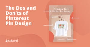
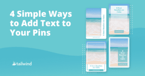
4 Simple Ways to Add Text to Your Pins

Four Pinterest Pin Designs on a blue background

You’ve heard using text overlays on your Pins is ideal, but how do you arrange text on your Pins correctly?

The truth is, there are many ways to do it – but if you’re unsure where to begin, we recommend starting simple with four ways to arrange text on Pins that follow Pinterest creative best practices below.

We’ll also go over the dos and don’ts for arranging Pin text, examples of text on Pins, plus how to utilize white space to your advantage!

Ready? Let’s get started!

[sc name=”everything-pinterest-webinar-image-cta”]

Adding Text on Pins on Pinterest: Do’s and Don’ts

Here’s the deal, the arrangement of your Pin text overlays matter! Rather than just throwing some text over your Pin, make sure you are keeping these important dos and don’ts.

  • DO fit your text to your image, not the other way around!
  • DON’T overcrowd your Pin with too much text. Pinterest is a visual platform!
  • DO keep your Pin text short and to the point.
  • DON’T use script fonts for text containing important keywords– the Pinterest visual search engine can’t read them!
  • On that note, DO include keywords wherever they fit naturally.

4 Ways to Arrange Text on Pins (with Examples!)

In this section we’ll go over some design methods that you can use to arrange text on your Pins. These methods will keep your design attractive and aesthetic.

Need some inspiration? Each method below includes examples Pin designs to get you inspired!

Center Titles Over Your Image

To add an eye-catching title, you can add a centered text overlay onto your Pin.

Always follow creative best practices when adding text overlays to Pins! Here are a few tips:

  • Centered text works well on landscape images or those without a central focus.
  • If the text is the focus on the Pin, a centered text overlay works great!
  • Centered text is great for Pins focusing on quotes or a background.
Example Pin with centered text overlay

Add a Vertical Text Overlay

We love using vertical text overlays! It’s a great way to use less space around the image and gives your Pin design a modern look.

Here are some tips for adding vertical text to Pins:

  • Try using vertical text overlays for non-keyword text such as branding or subheadings.
  • Add your URL as a vertical text overlay to add some dimension.
  • Place vertical text on the edges of the Pin, with some room around it to breathe!
sample Pin with vertical text overlay

Offset Your Text

Without disrupting the focal point of your image, you can offset text overlays on your Pin!

Just remember these best practices when offsetting your Pin text:

  • You can add offset text on the corners or bottom of your Pin without covering the image.
  • As you’re working with offset text, make sure important elements aren’t covered in the feed by Pinterest buttons (especially in the bottom right!)
  • Offset text looks great when there is space in the photo on either side or corner.
Pin example with offset text overlay

Work in White Space

White space is your friend! You can use or create white space with frames to give yourself room to add text overlays.

Here are some tips for utilizing white space on your Pin:

  • Add your Pin image into a frame or shape cutout to emphasize the focal point of your Pin, leaving plenty of white space around it for text.
  • Use white space to separate text using graphic elements. Sometimes lines or dots can give your Pin a minimalist look.
  • When using square images, this allows for more white space around the image.
Pinterest text example with white space overlay

Create Perfect Pins with Tailwind Create

Creating stunning Pin designs can be hard. We get it!

Between understanding Pinterest creative best practices, knowing how to arrange text on Pins correctly, and choosing the best design elements, it’s a lot to juggle.

Tailwind Create Pin Design Tool

That is why we’ve introduced Tailwind Create!

It takes the guesswork out of Pin creation with thousands of editable Pinterest templates built by Pin experts and designers.

Tailwind Create allows you to scroll through templates and sort them by industry and niche or Pin format.

You can also edit and customize every design! Favorite your most-loved templates to use again and again!

Creating fresh content has never been easier! We add new templates and designs all the time to make crafting fresh, exciting new designs stress-free.

Want to be one of the first to test out Tailwind Create? Sign up for our exclusive public beta!

[sc name=’pinterest-boilerplate’]

Pin Me For Reference :

Stumped on how to make your titles and Pin copy work with your image? Here are four ways to arrange text on Pins with tips!